Modern Classic
A dream client. The inventor of denim. One of great retail brands of the world, that evolved with and helped shape the spirit of the times throughout its rich history.
With the mobile revolution in full swing, it was the perfect time to re-invent the brand, online. We combed through vast amounts of material created by W+K for seasonal campaigns, and in-house brand design, and distilled it down to its core, timeless characteristics, with a few seasonal touches. Over 6 months of design concepts and 6 months of execution, we took the best practices of the time, and applied them in a way that amplifies the character of the brand, while better serving a varied audience on their various devices.
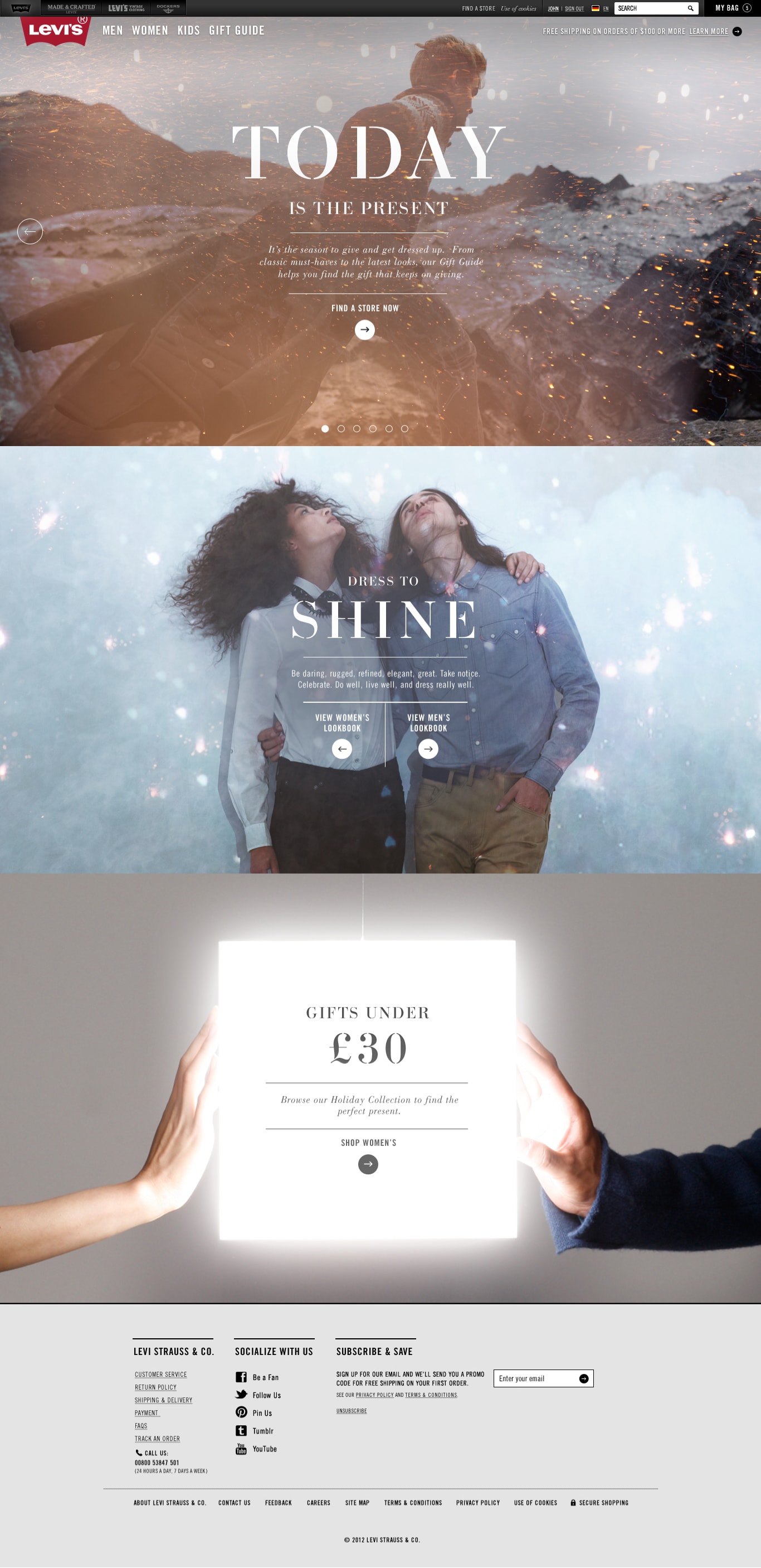
The final product is rough around the edges, and looks dated. Like any first attempt, it was a big step forward, but needed ongoing improvements. It needed the kind of commitment we couldn’t provide as an agency. Our success was in getting a big brand to embrace new-at-the-time but now commonplace ideas, as e-commerce became a part of everyday life, and preparing them for the mobile present we live in today.

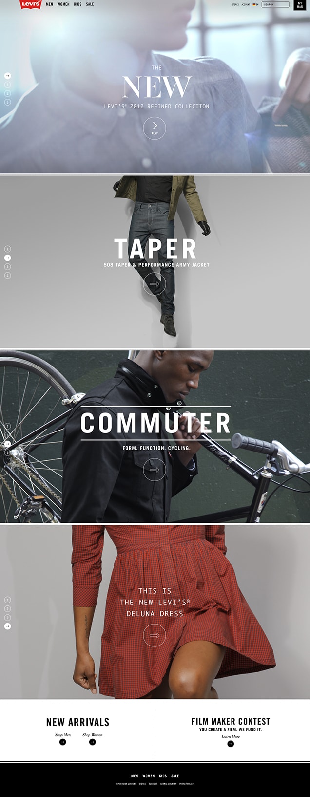
Smart Layout
This wasn’t a new idea in 2012, but it wasn’t something big brands were doing well. That customers would use a phone as readily as a desktop computer to shop online was still a controversial idea.

Bold Images
Images previously reserved for print. Product, lookbook, campaign, brand, history: impeccably photographed and an internet with the bandwidth to display them big and borderless.

True Voice
A brand that for a century had a truly American typographic character (and helped define what that means), suffered the scourge of Arial, online, for decades. Finally, we had web fonts, but brands this big were still afraid to use them.
Brand Positioning
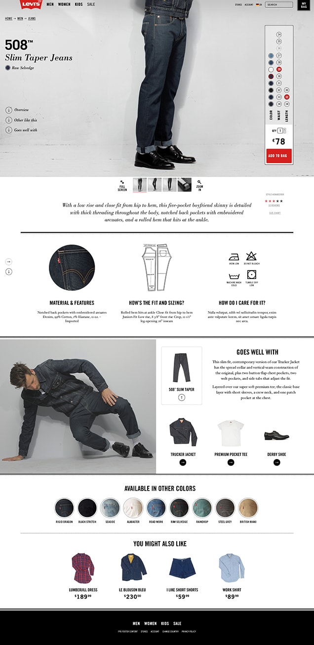
Dress for Purpose
Beyond workman’s denim: practical fashion, for men and women. This was the positioning for the products, so we applied it to the website. Make it elegantly functional; design it to do a job.
No tricks. Flat. Photos on white, black text. These were the days of iOS 6, but the thinking was MacOS System 6. And by going counter to the stylistic conventions of the time, we’d also align ourselves with the fashion brands Levi’s was chasing with its expanded clothing line and ambitions beyond denim.
Layout
- Fluid
- Expansive
- Adaptive
- Focused
- Rhythmic
- Narrative
Photography
- Refined
- Tailored
- Natural
- Emotive
- Nostalgic
- Reflexive
Typography
- Unadorned
- Direct
- American
- Printerly
- Timeless
- Pragmatic
This is a pair of Levi’s
Concept


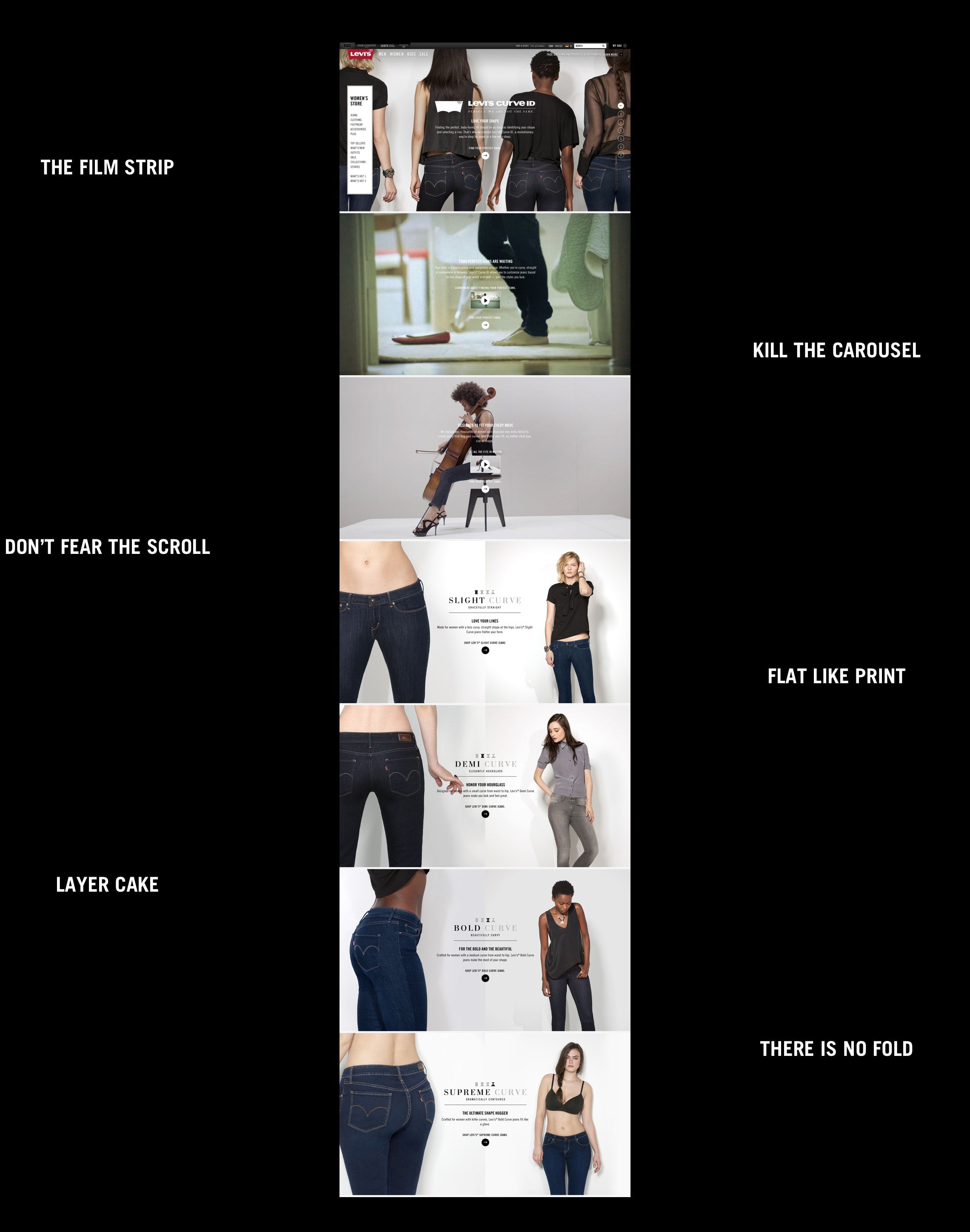
Some ideas fell into place immediately: long pages of “filmstrips” instead of click-through carousels. Grids that behaved like text, wrapping with the page, centered like words. A loose layout that uses typographic contrast and whitespace as signposts.
Eventually, extra elements snuck their way in, adding refinement and structure, but losing the naïve, refreshingly unfussy simplicity of the first layout attempts.
Revised Concept

The Levi’s® Brand Online
Style Guide
Tone
Simple
The straightforward, honest voice of the brand is best expressed when all distractions are eliminated.
Refined
Care and attention to detail, consistency, pattern, rhythm, elegance.
Bold
Fearless, confident. We express our ideas clearly. We speak in caps without shouting.
Classic
Built to last beyond fashion seasonality. History sets the stage for the future.
Color

Black
The strength of black is controlled visually through line weight and dotted lines.

White
White is negative space, or knocked-out elements on a photographic background.
Type

A Case of Confidence
Although uppercase text has become associated with shouting, historically, it's common in signage and commercial titling. The uppercase on Levi.com connects us with that history.
We reserve caps for titles and brief callouts.
Whenever possible, caps should be gently letter-spaced to allow the letters to breathe.
The Color of Weight
Instead of using color to denote visual hierarchy, we use font weight. Heavier type is optically darker, while thinner is lighter. This, along with size, white-space and border lines, allows for limitless variation.
As in photography, the constraints of black and white can be an opportunity.
The Right Face
Webfonts and CSS3 are the key to using Trade Gothic on Levi.com. In CSS, always obtain licensing through fonts.com for Trade Gothic.
Always ensure that the fonts are correctly mapped to their respective weights, to avoid the “fake bold” effect that distorts the typeface.
Layout

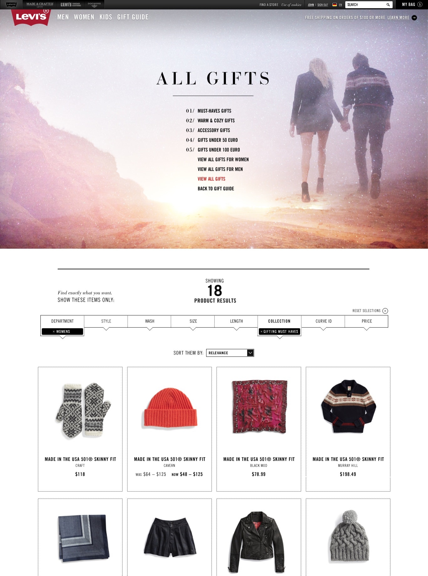
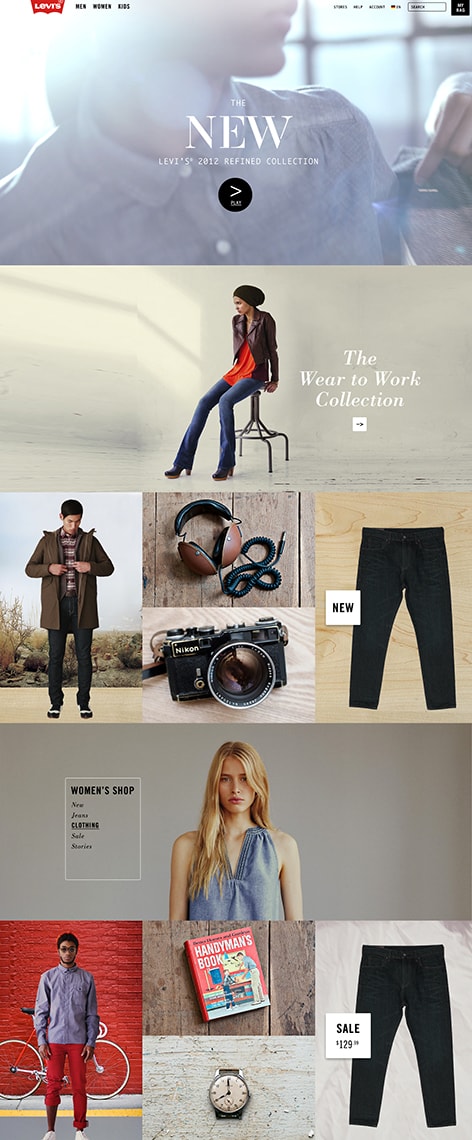
Department
This design seems so obvious, so pedestrian today, but at the time, the struggle was real.
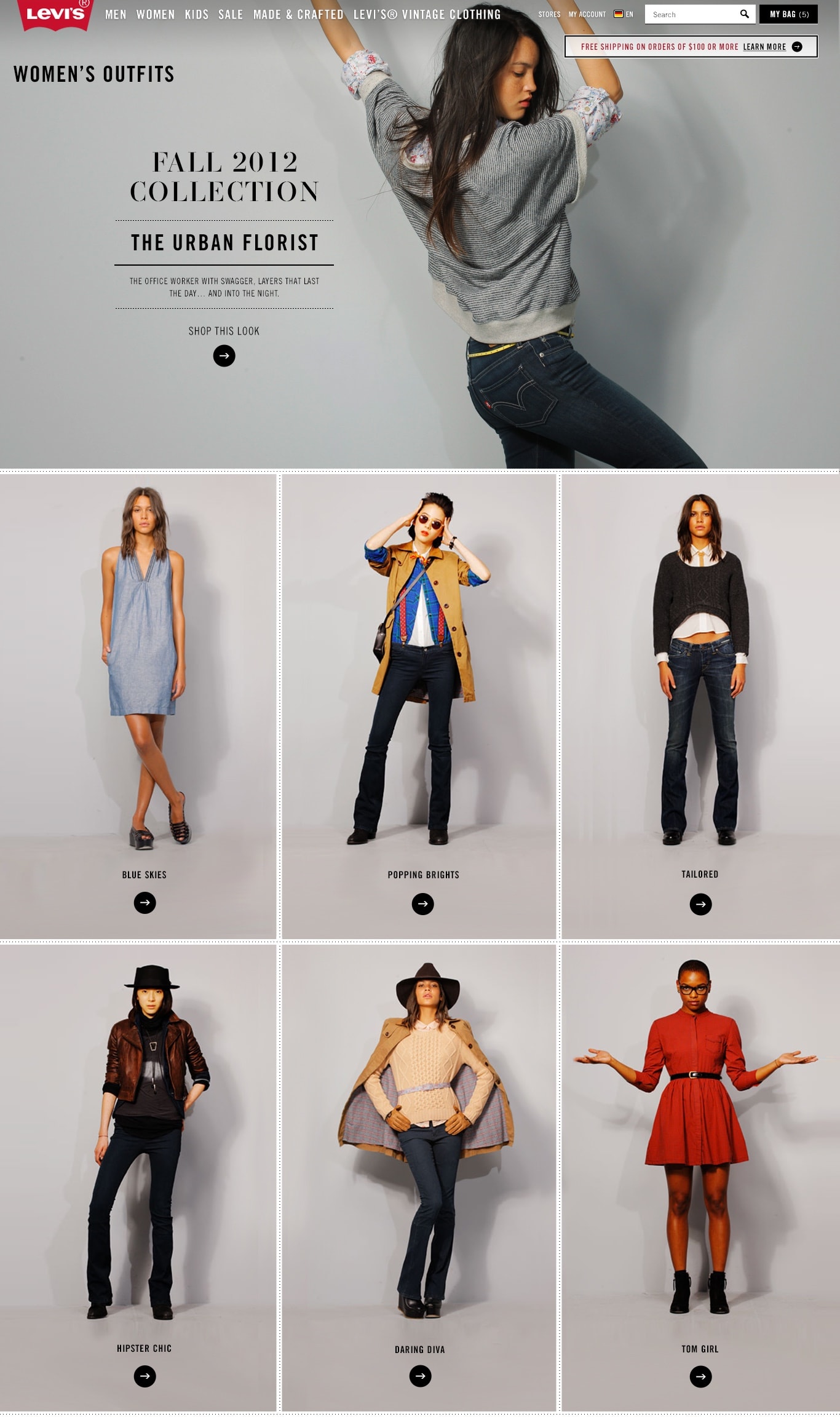
The idea: users scroll without thought, without having to make any decision. But a click is a decision, it’s heavy.
Let the images loose and tell a vertical story, like a super-tall magazine, simplify the interaction to one axis, no clicks, and let it unfurl.
Category

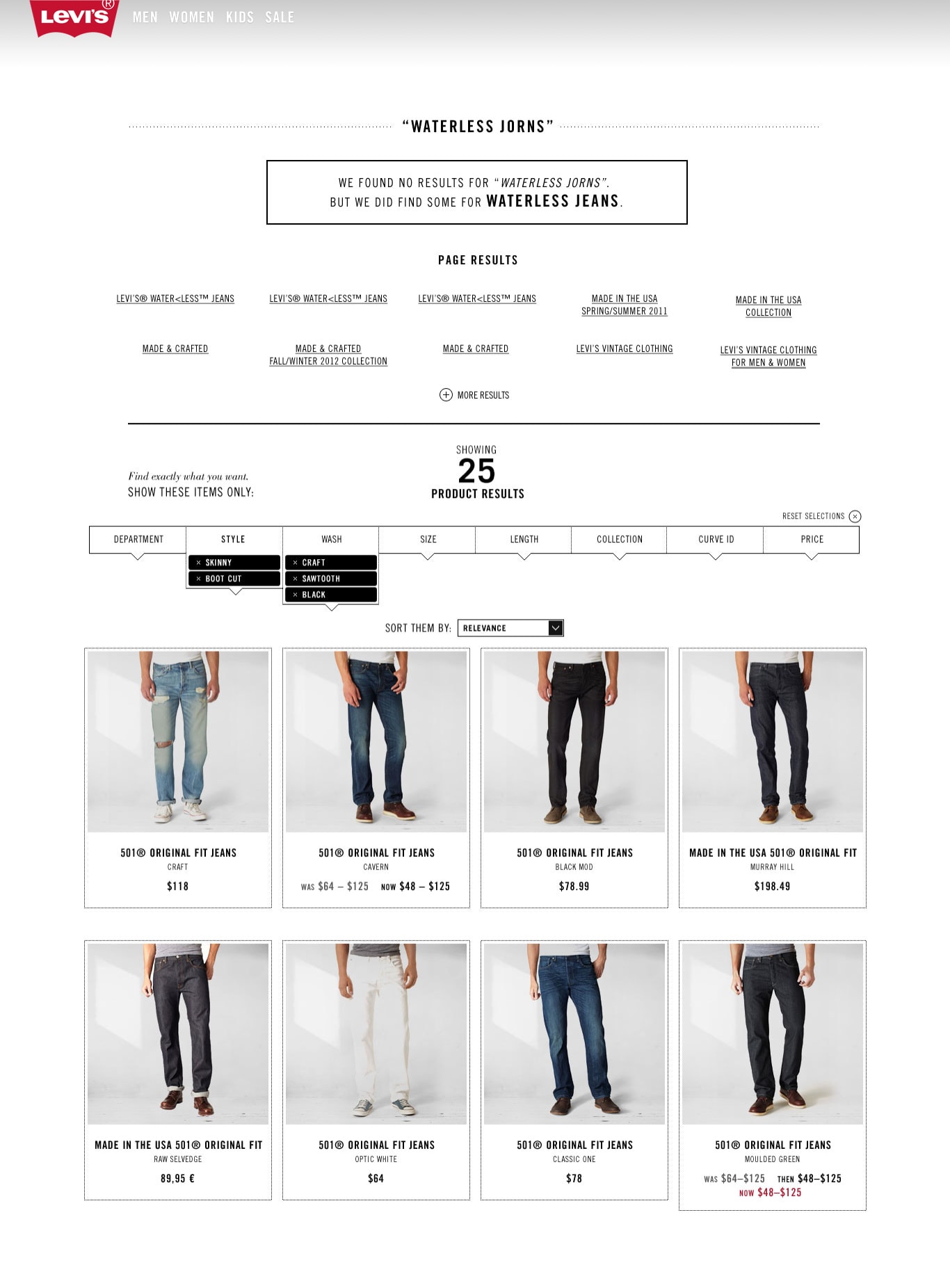
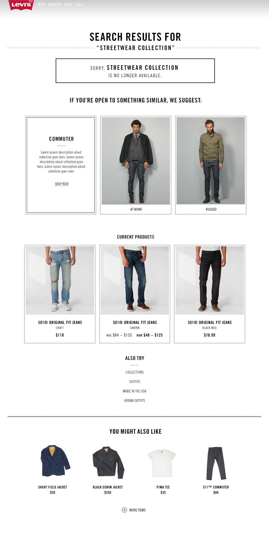
Search
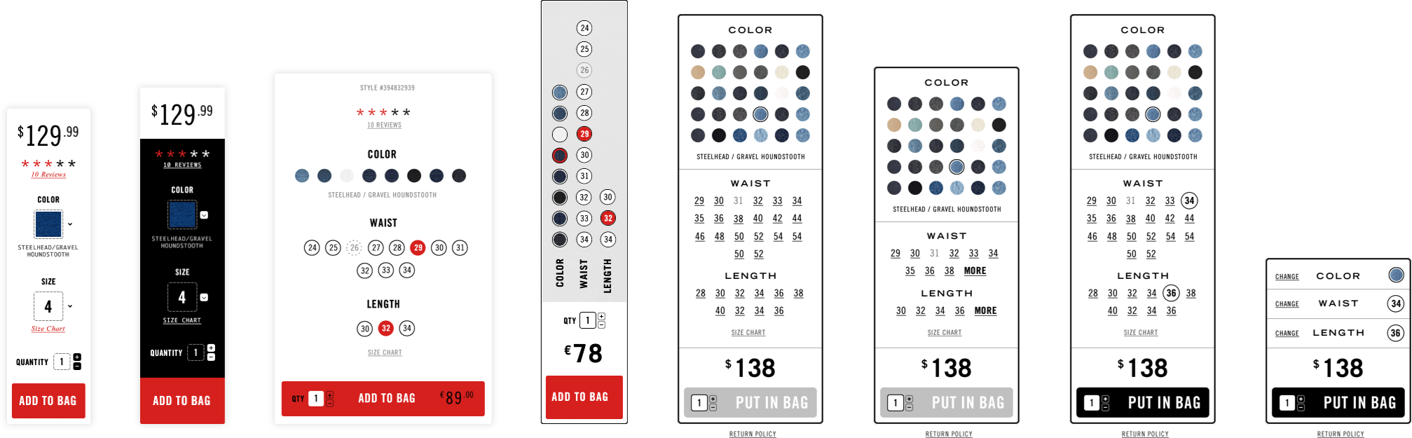
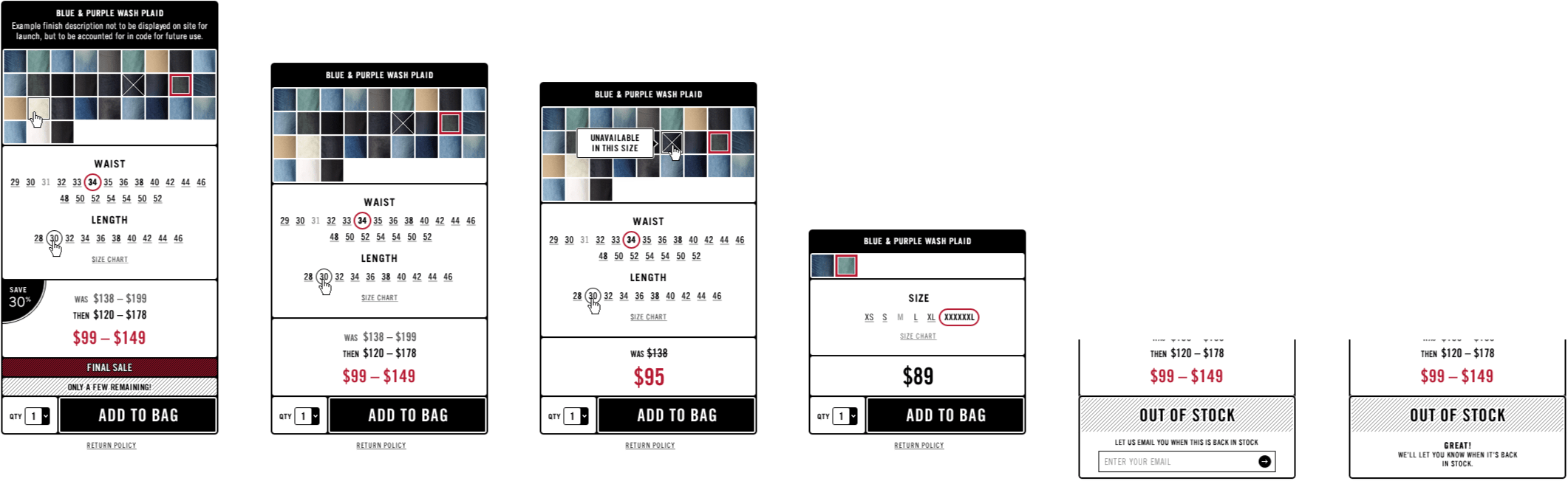
Product Detail


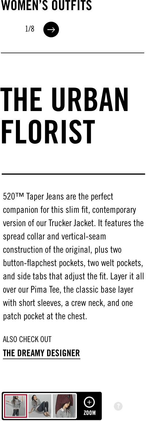
Outfits
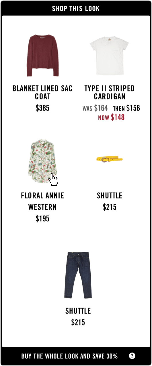
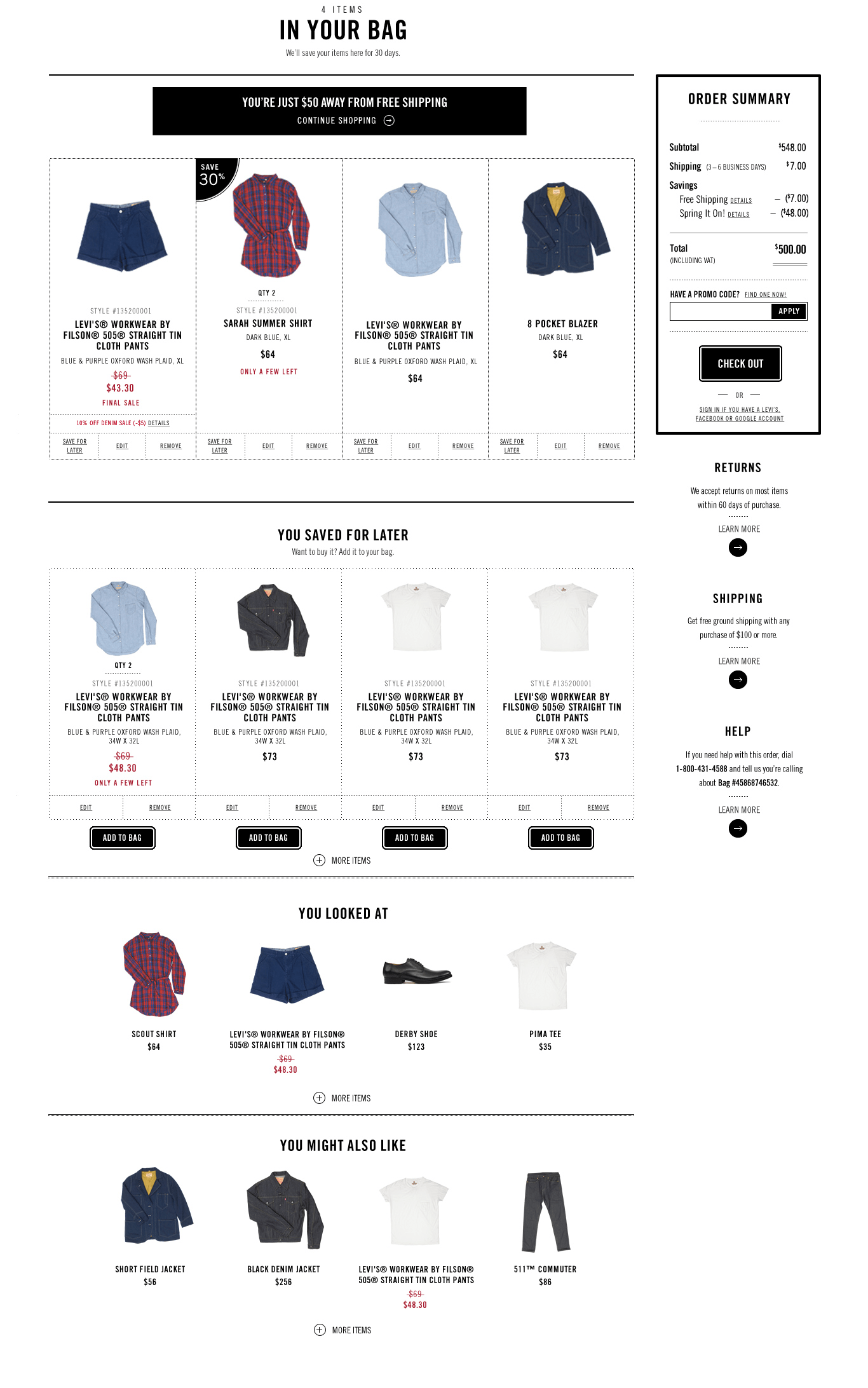
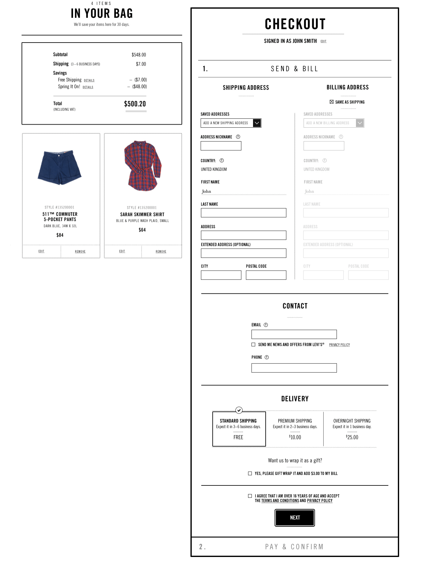
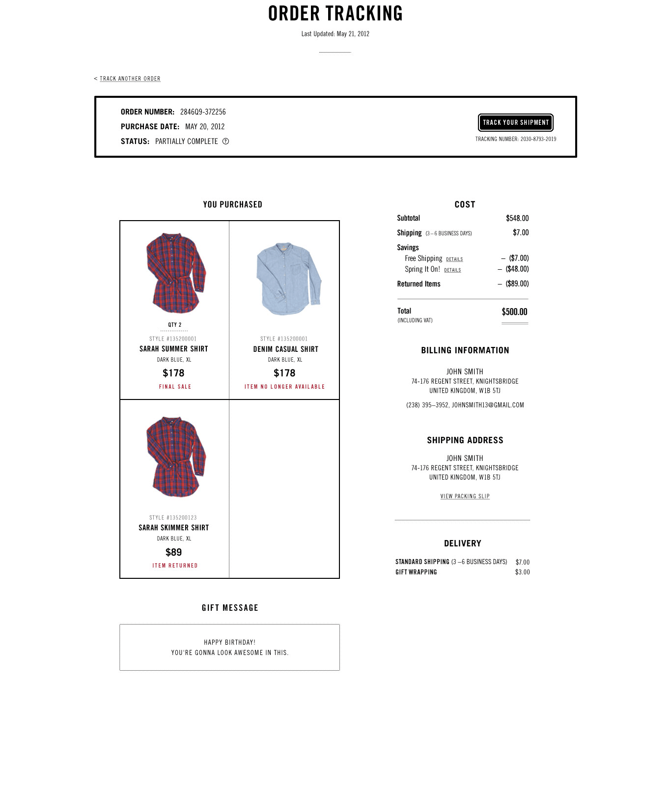
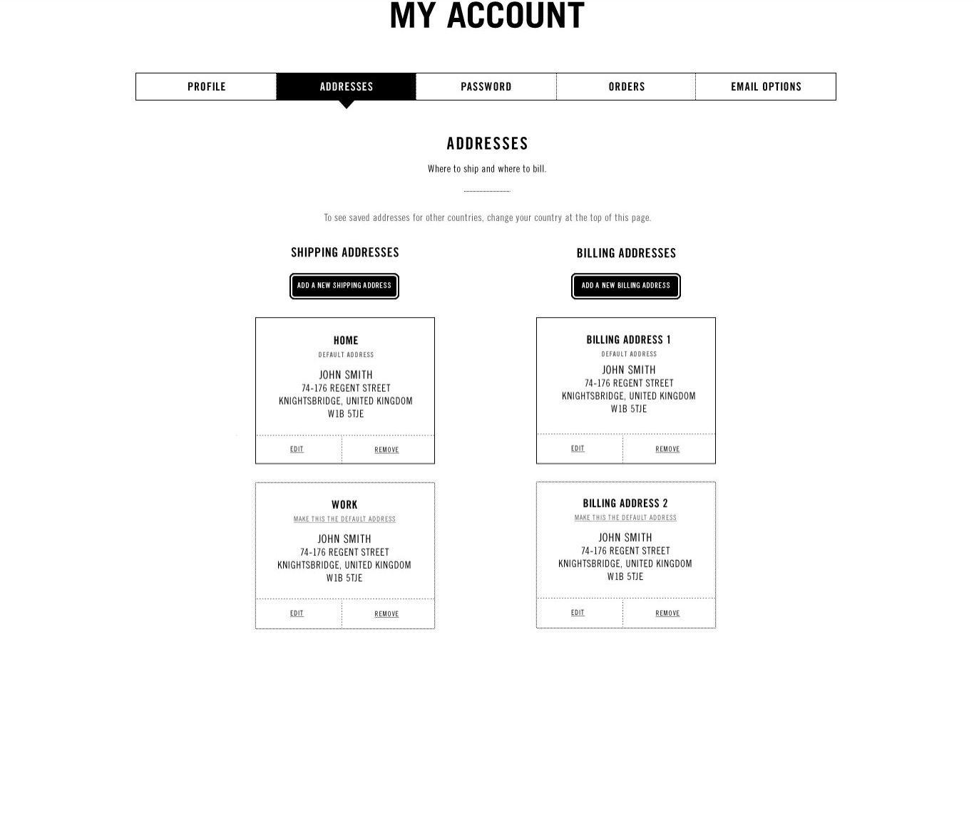
Purchase Flow

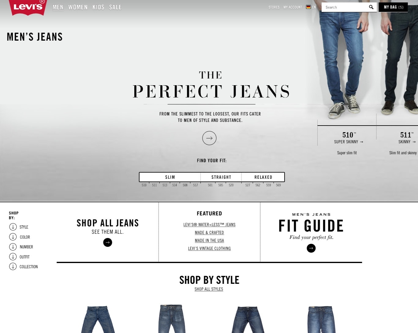
Fit Guides
Men
Women

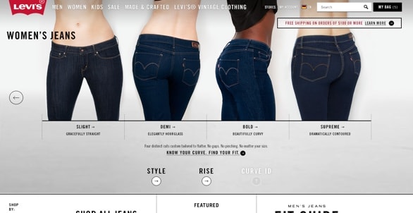
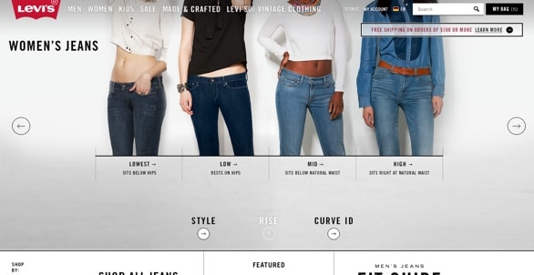
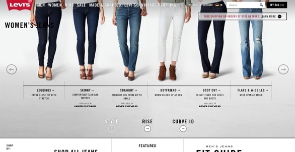
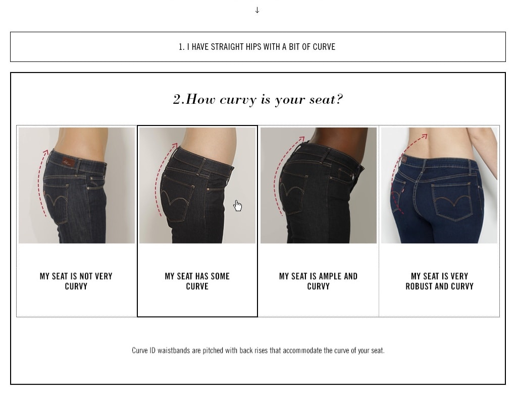
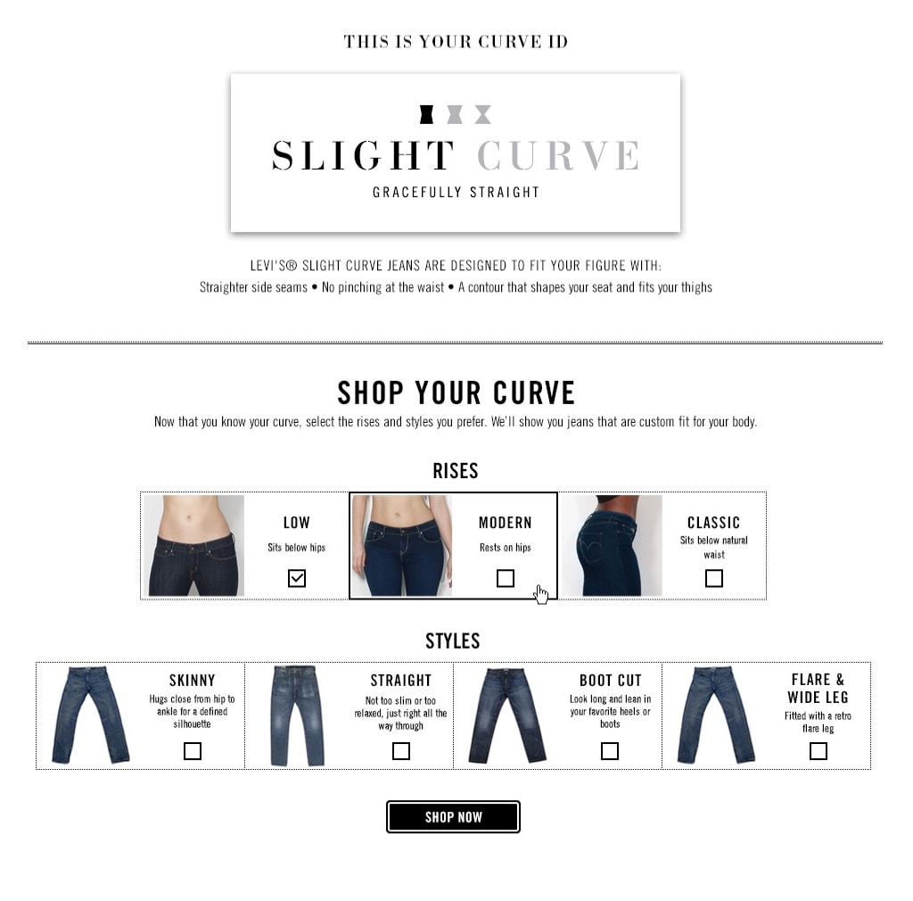
What’s your Curve ID?
Tell us about your shape to find your custom fit.