Made from scratch
You should be able to eat well, even when you have no time to cook or dine out.
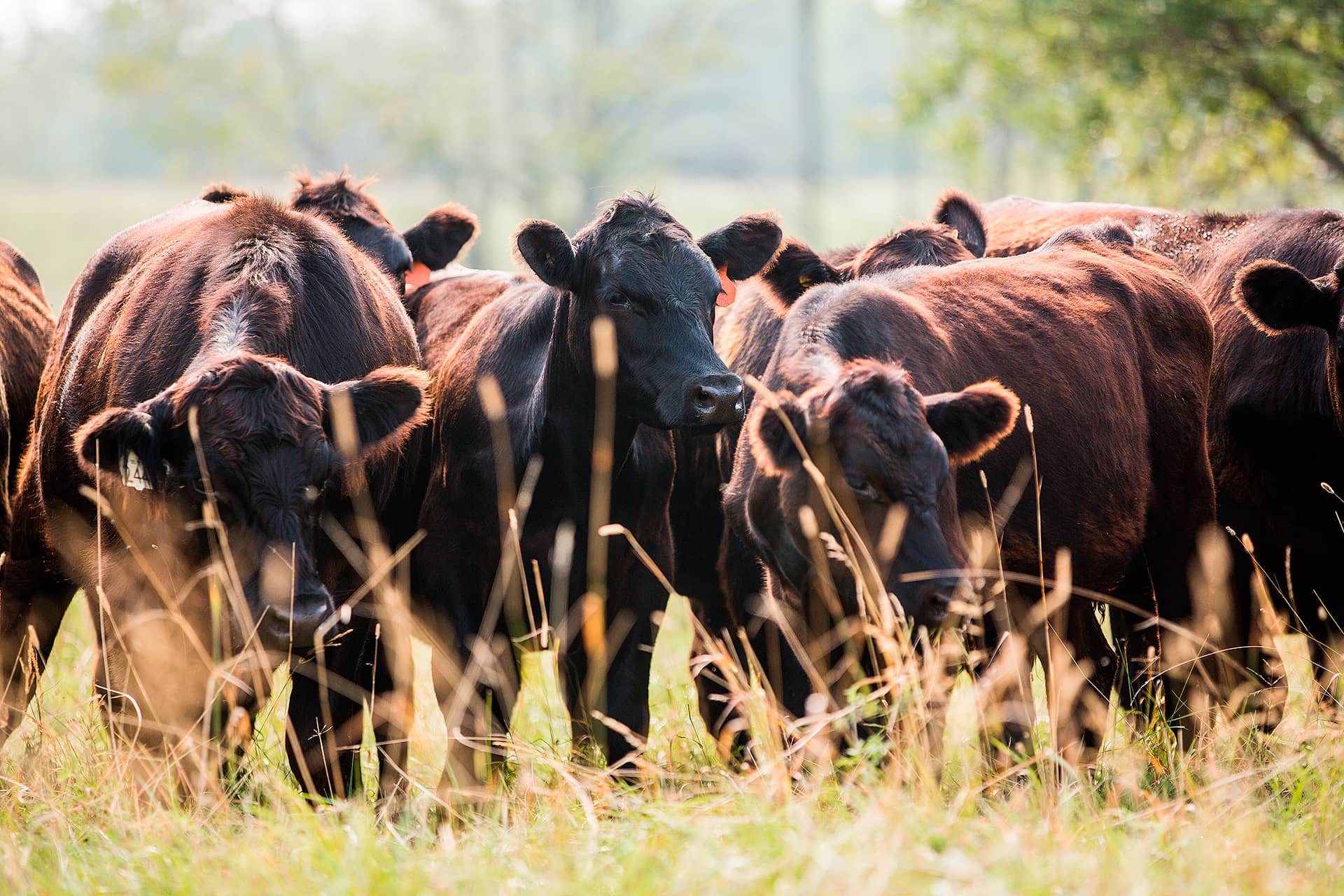
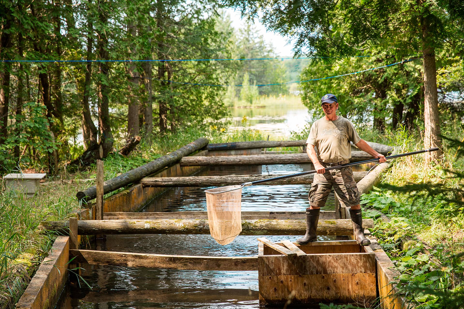
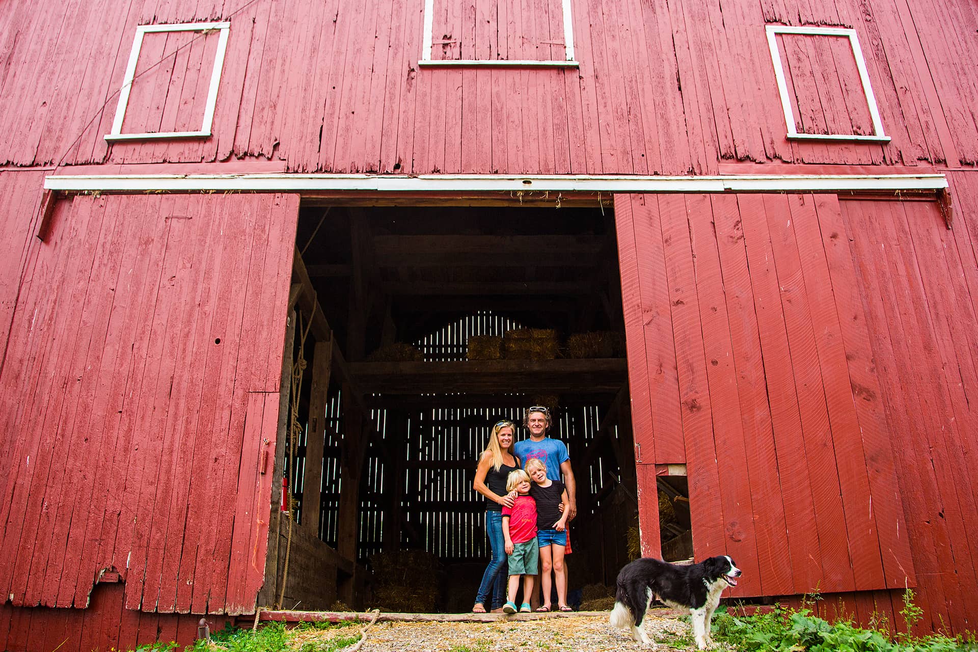
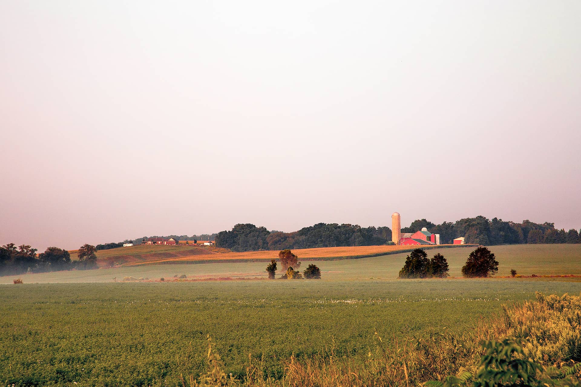
Food that connects you to local agriculture.
Made in-house,
with flavours that enlarge your world.
Delivered by friendly folks.
Giving you time to simply enjoy the moment.

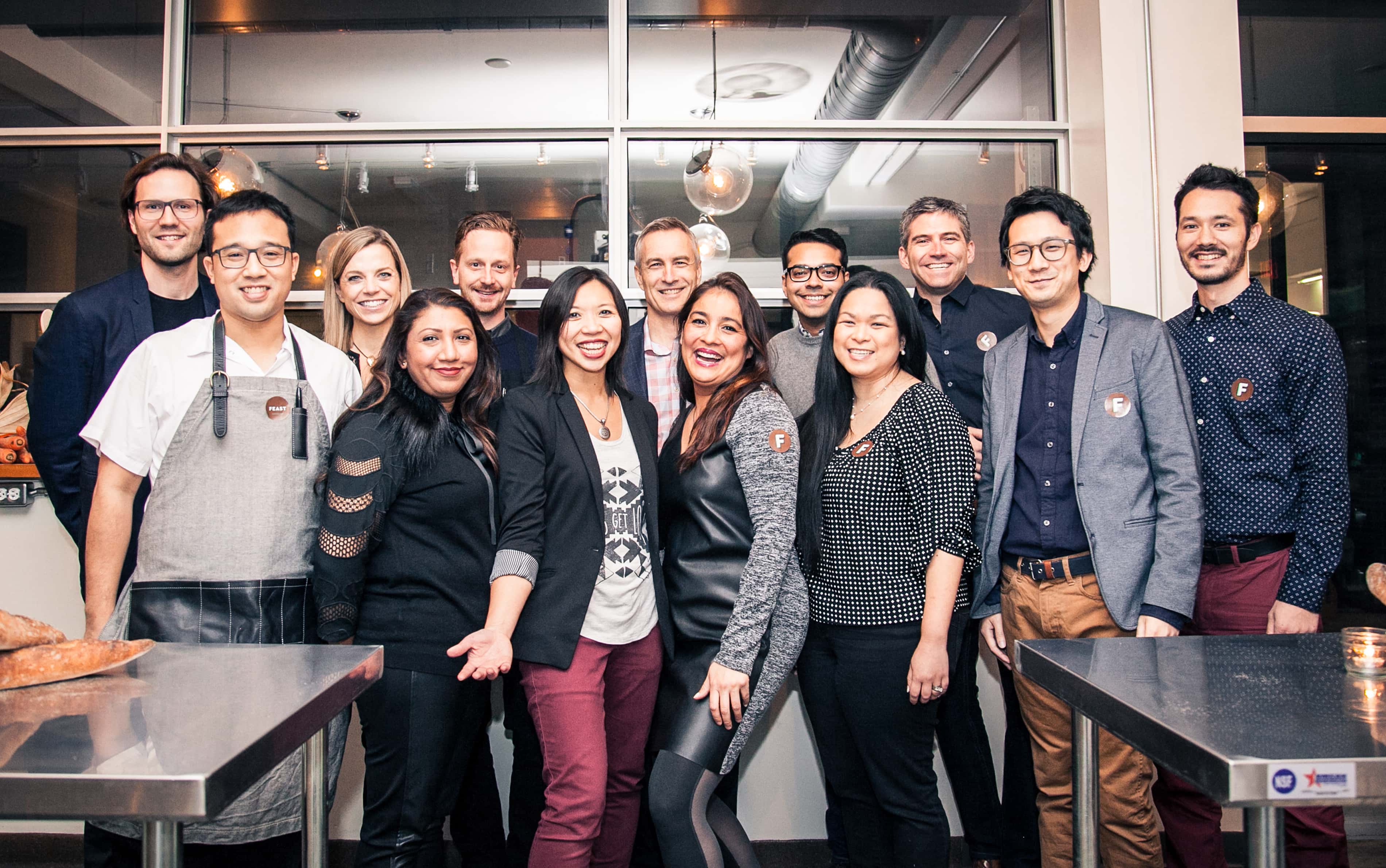
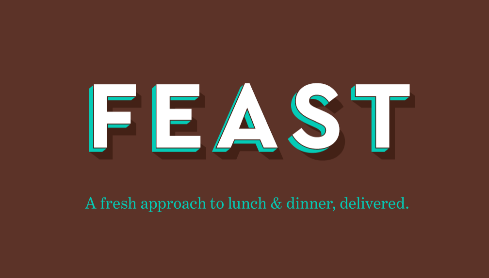
1. The Brand
We set out to offer a dining experience that was as great as the best restaurants in the world: innovative, stimulating, delicious, nourishing dishes. Speed of delivery and convenience were also part of the offering, but easy to convey. Our thinking was that we would be perceived as a technology / logistics service, an app, alongside take-out aggregators, so the hurdle was to develop a credible culinary voice.
Drawing from the most revered star-chefs and destination restaurants, the foodie-aspirational media, and up-and-coming fast-casual restaurants, we baked it all into a mobile-app brand. Taking the newest, best ideas in food today, and applying them to an affordable, convenient, everyday service.
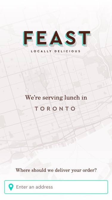
We planned to bring together a network of independent chefs under one roof, so the identity was oriented to that idea: an app that felt like going to a nice market. A place where you expect to find the best foods, discover new things, and where the price isn’t the point. Refined yet accessible, a casual experience. An app that has a sign, that feels like a place.


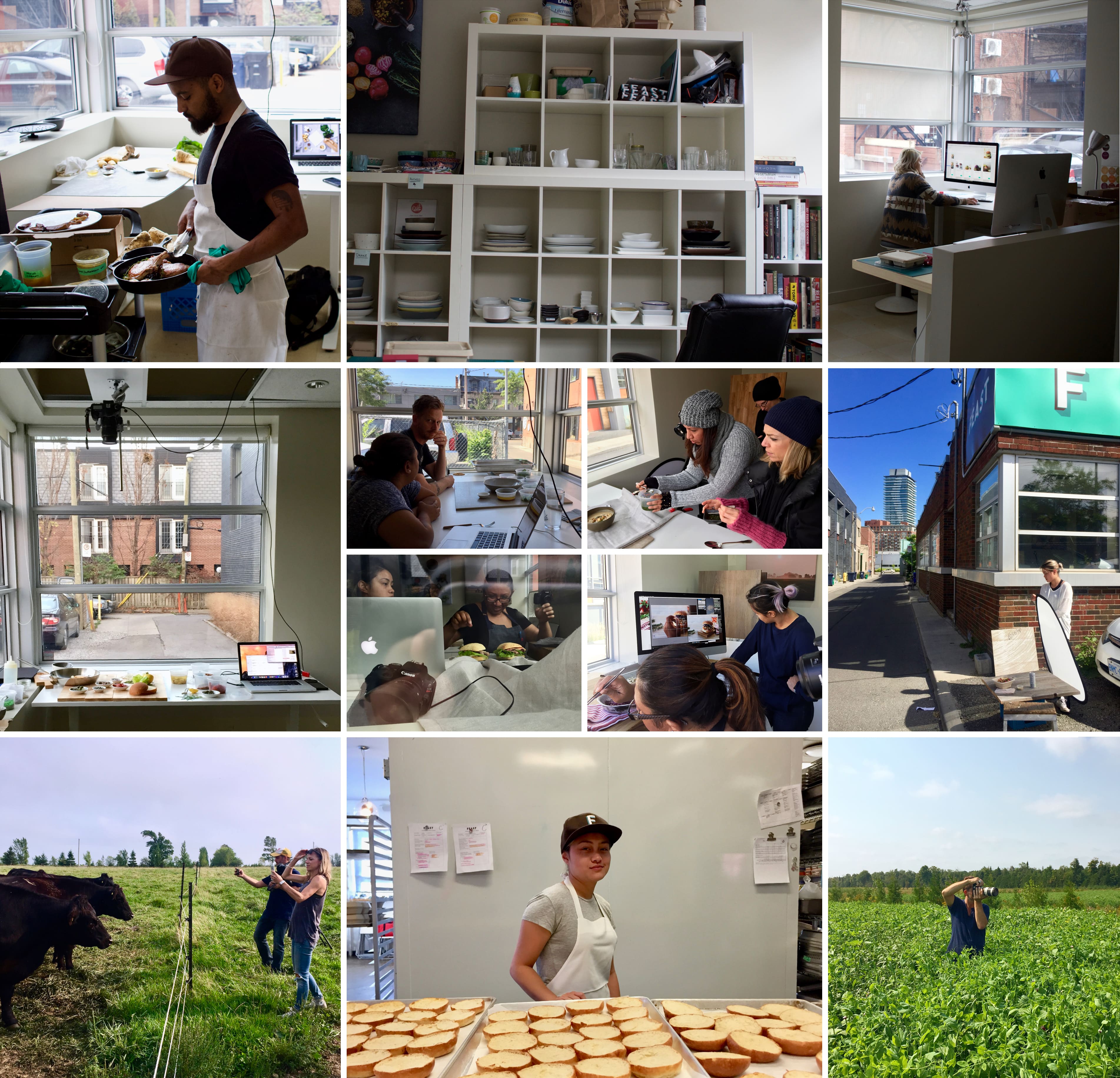
Brand Story: Photography
Source
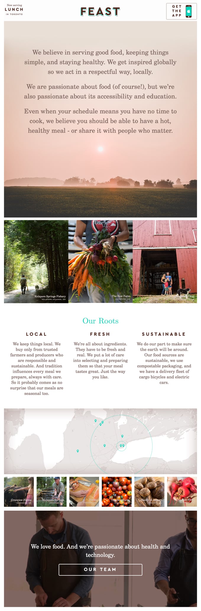
Connecting urban dwellers to the rural producers and local suppliers around them. Telling their stories. Real talk about the challenges of sustainable production.
- Natural
- Proud
- Grounded
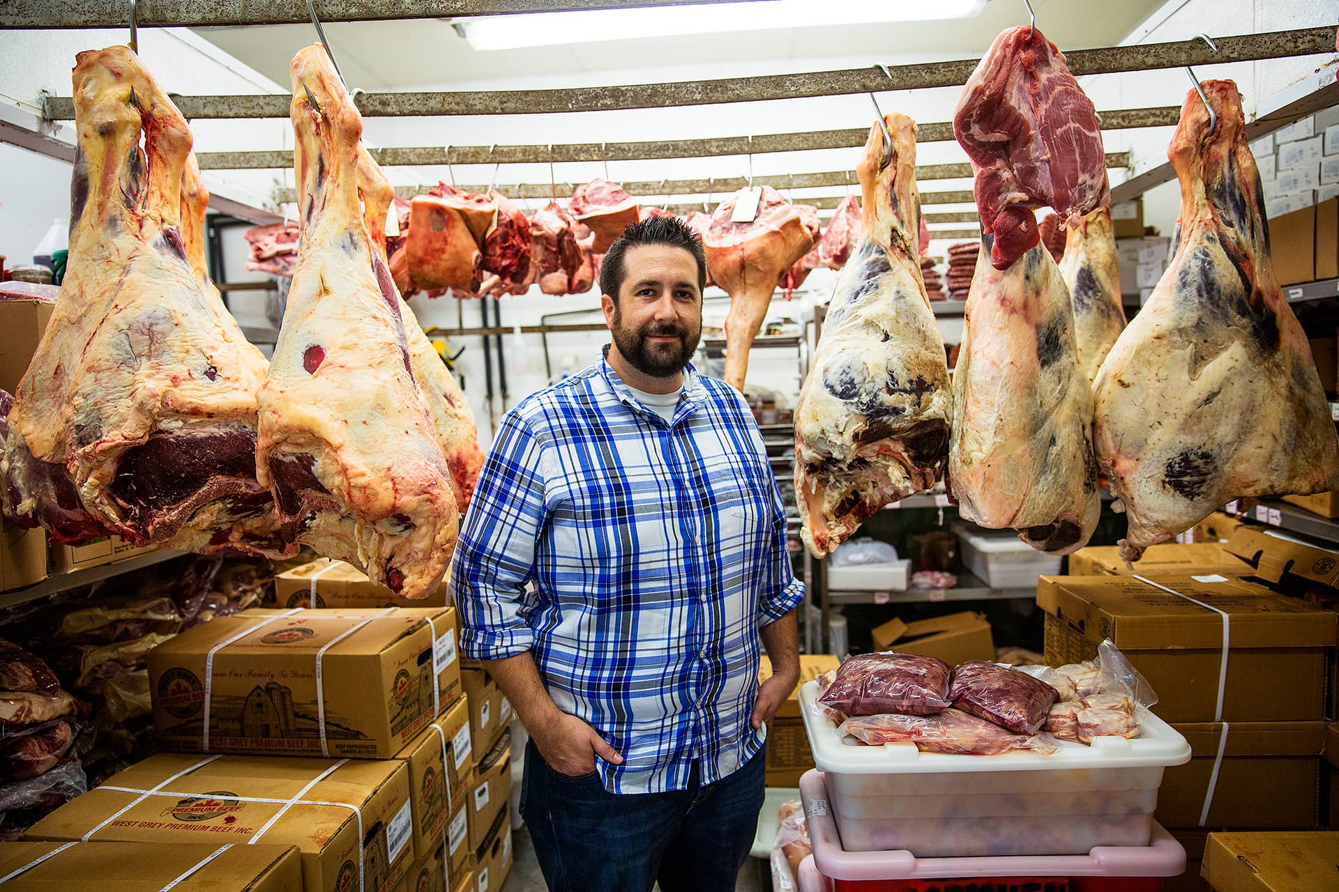
Craft
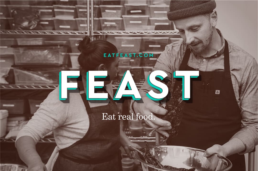
Our key differentiator and greatest asset: in-house chefs and cooks at the core of our team. How we think about food is shaped by our relationship with the person who made it. Walk into our kitchen as you browse the menu.
- Expert
- Gestural
- Candid
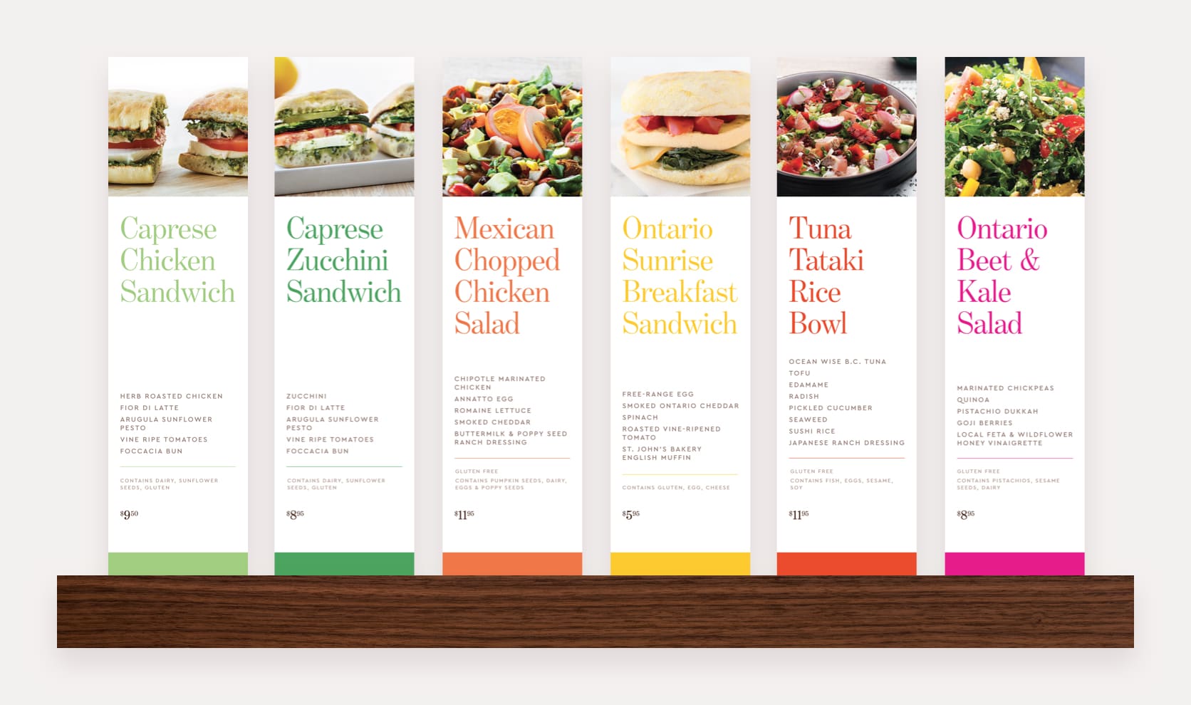
Flavour
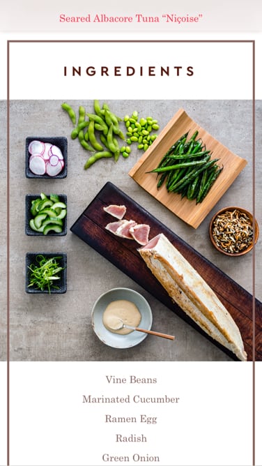
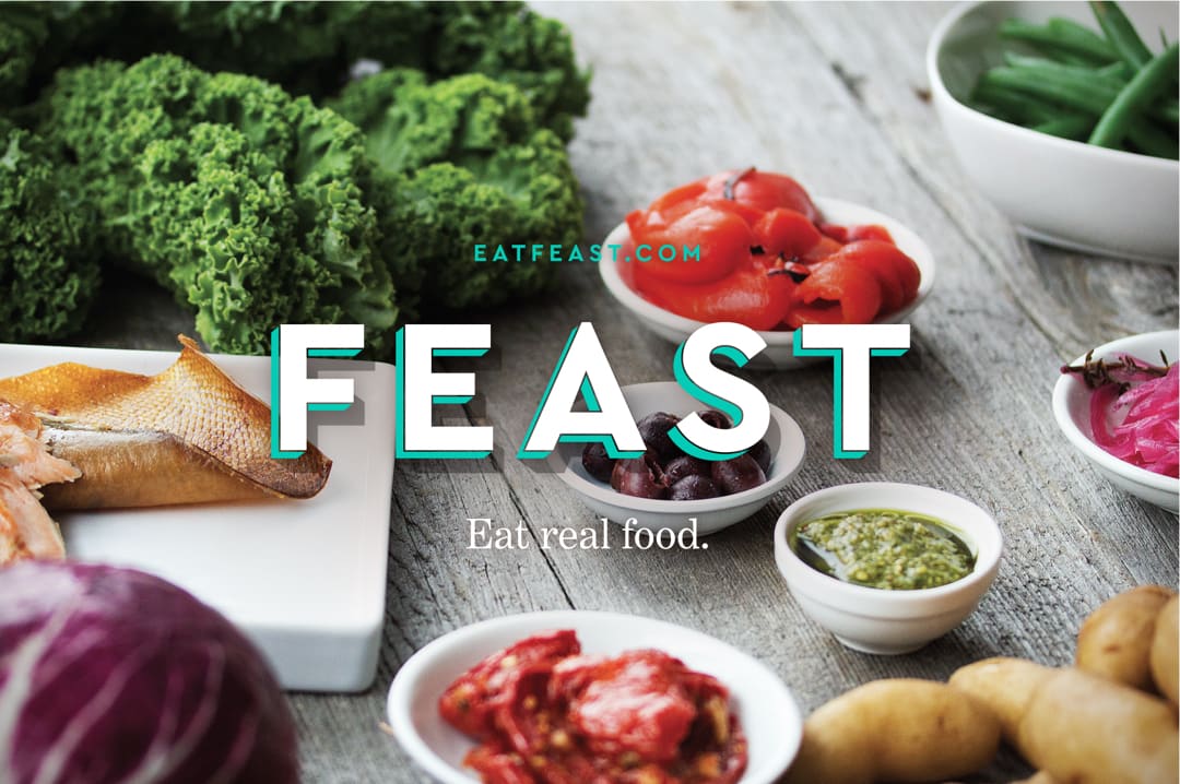
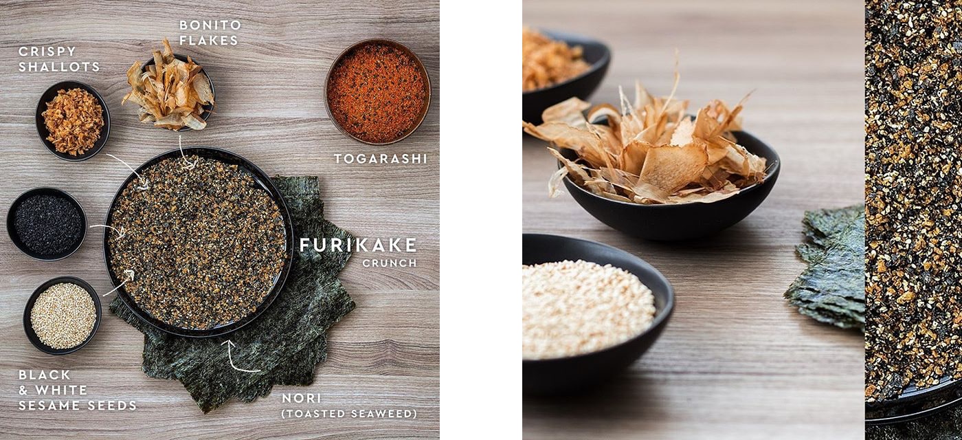
It’s hard to describe complex flavour and texture. It often comes down to listing ingredients. Inspired by our chef’s mise-en-place, we laid out the components of each dish in their ideal individual state to communicate flavour, visually. A taxonomy that’s also a composition.
- Vibrant
- Graphic
- Composed
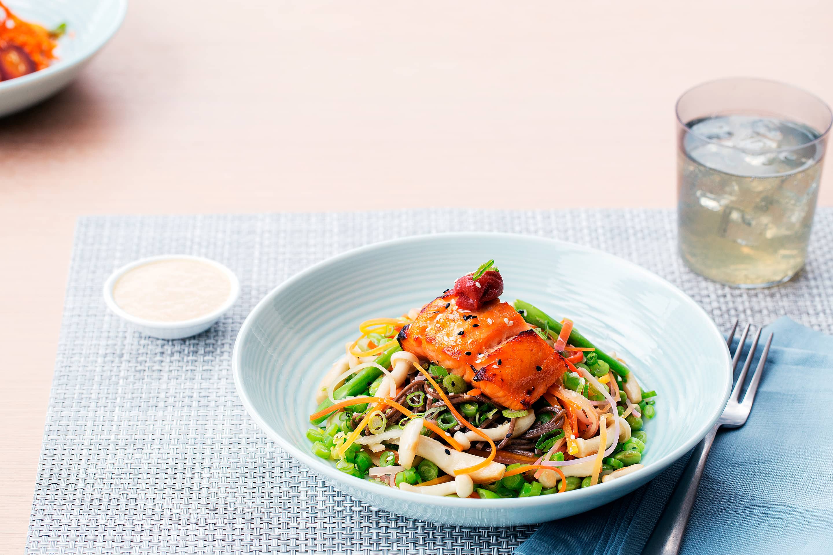
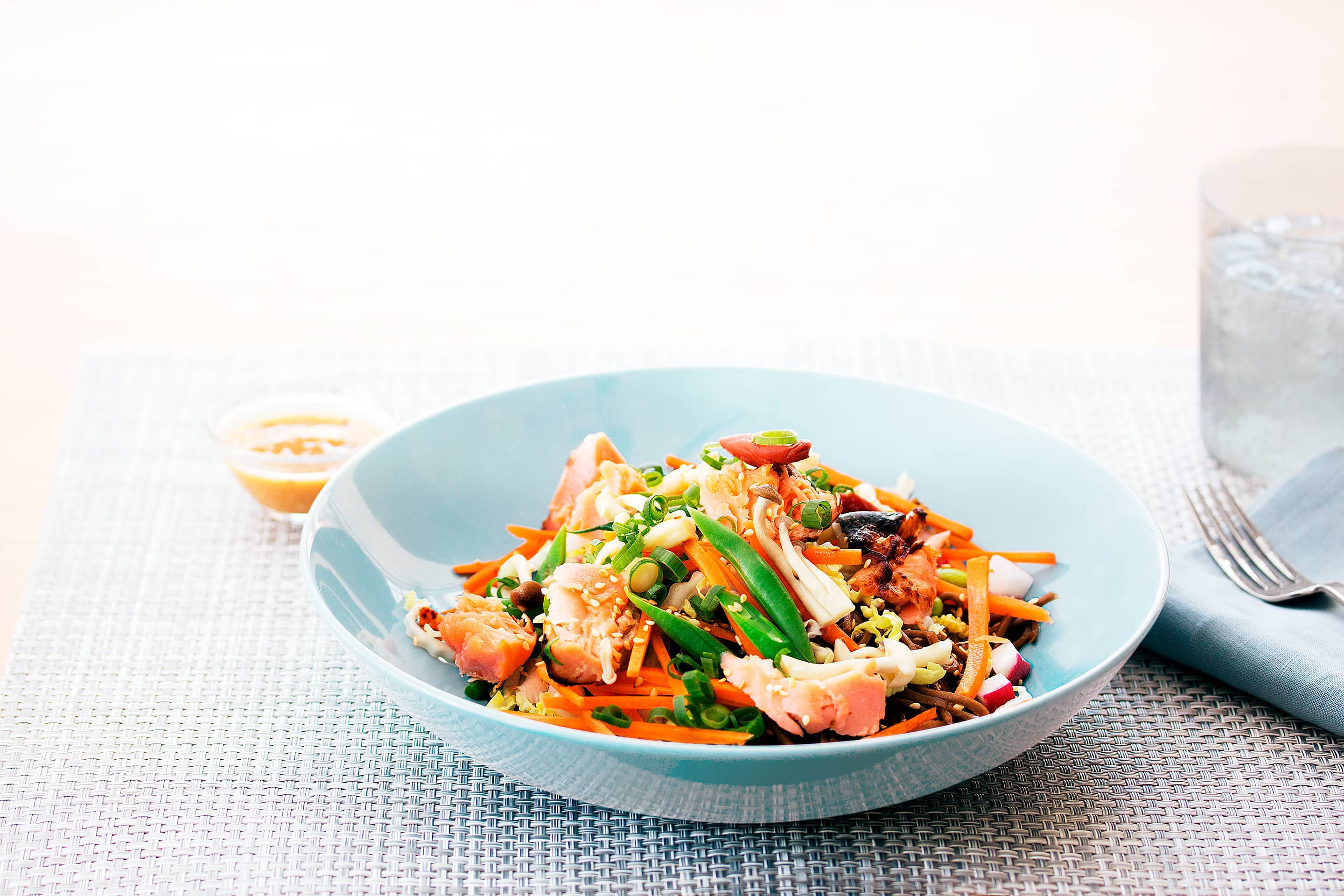
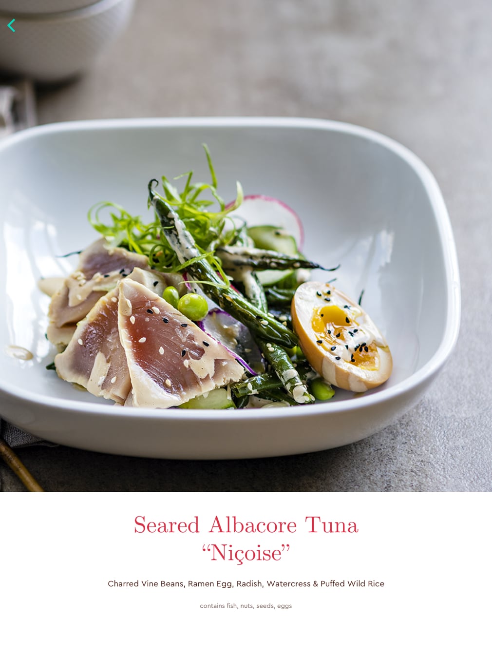
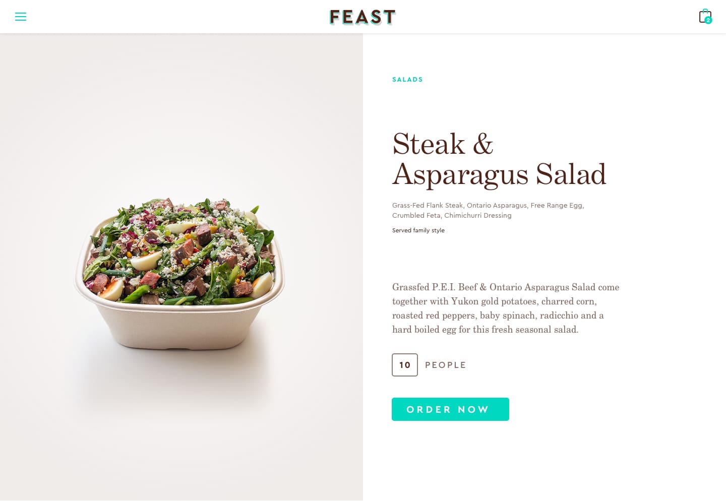
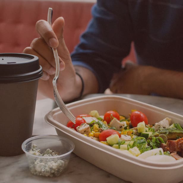
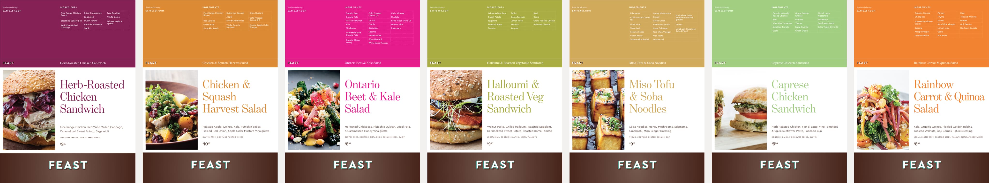
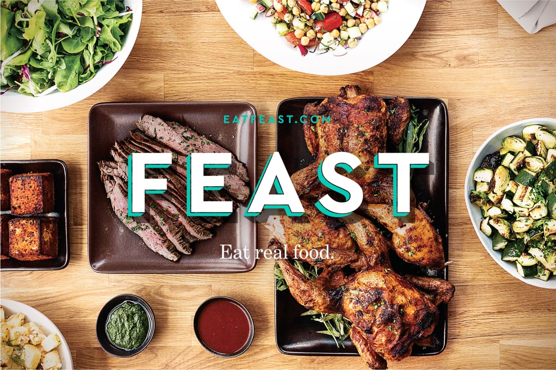
Plate
This is where it all comes together. In a restaurant, you have to read the menu and imagine, with difficulty. We can show you. But photography can cheapen or elevate. We invite you to the table.
- Inviting
- Focused
- Subjective
Over time, we evolved our approach. Dishes changed, and with that came re-shoots. Each iteration got more natural, finding ways to present the dish more honestly, refining and simplifying our styling, and focusing on the user need to preview the dining experience.
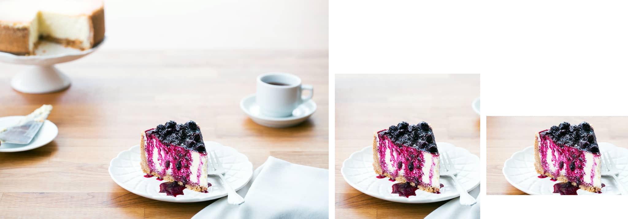
Responsive photography: content for multiple platforms.
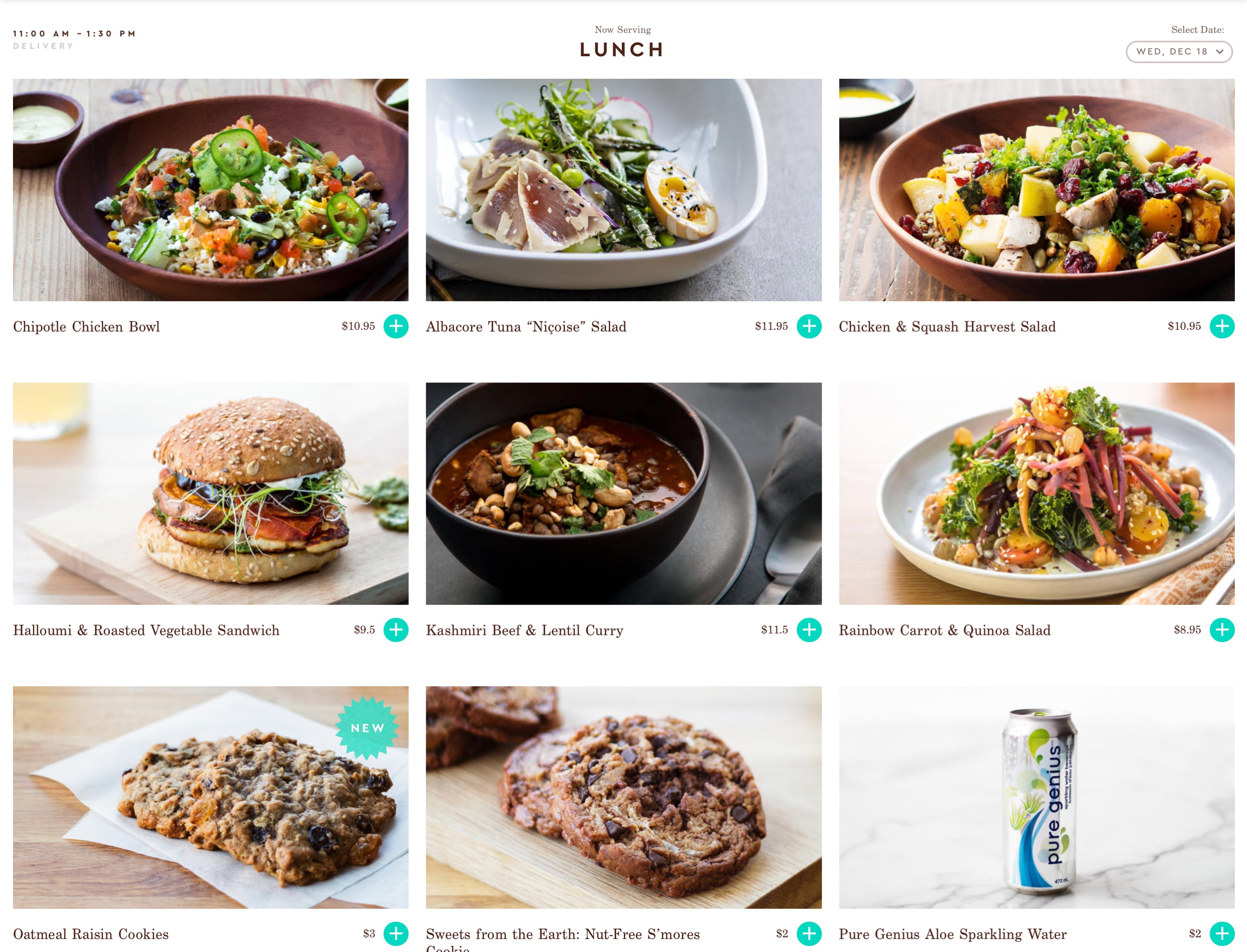
Differing points of view: substance over style. Overhead shots make for bold, graphic compositions. But we settled on the more inviting, down-to-earth, less stylish, traditional front angle.
2. The App
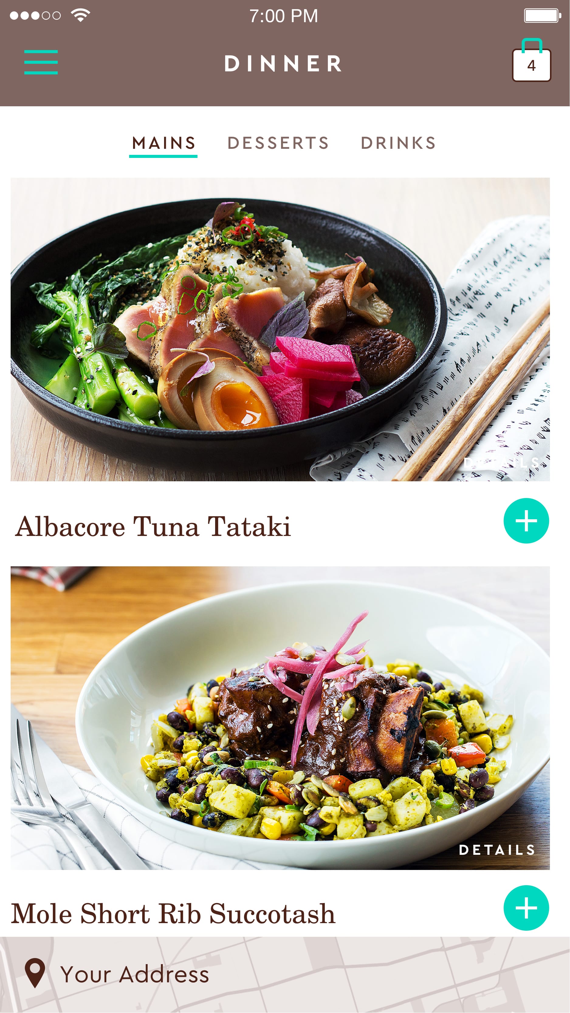
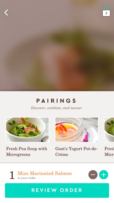
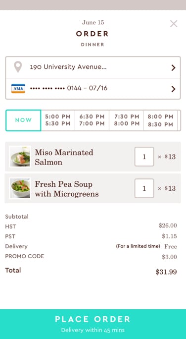
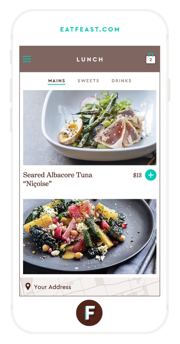
The core experience of browsing for what to eat, and then ordering it, is really simple.
The goal was to create an experience that was smooth and fast, but also as rich and as deep as the food and its ingredients deserve, for the repeat customer, or the foodie, who wants to know the details.
Unlike a take-out aggregator, everything is custom, shot in-house, “made from scratch”. Stories behind the food, the ingredients and their producers, the kitchen team that makes it, and the city we cover to bring it to you.
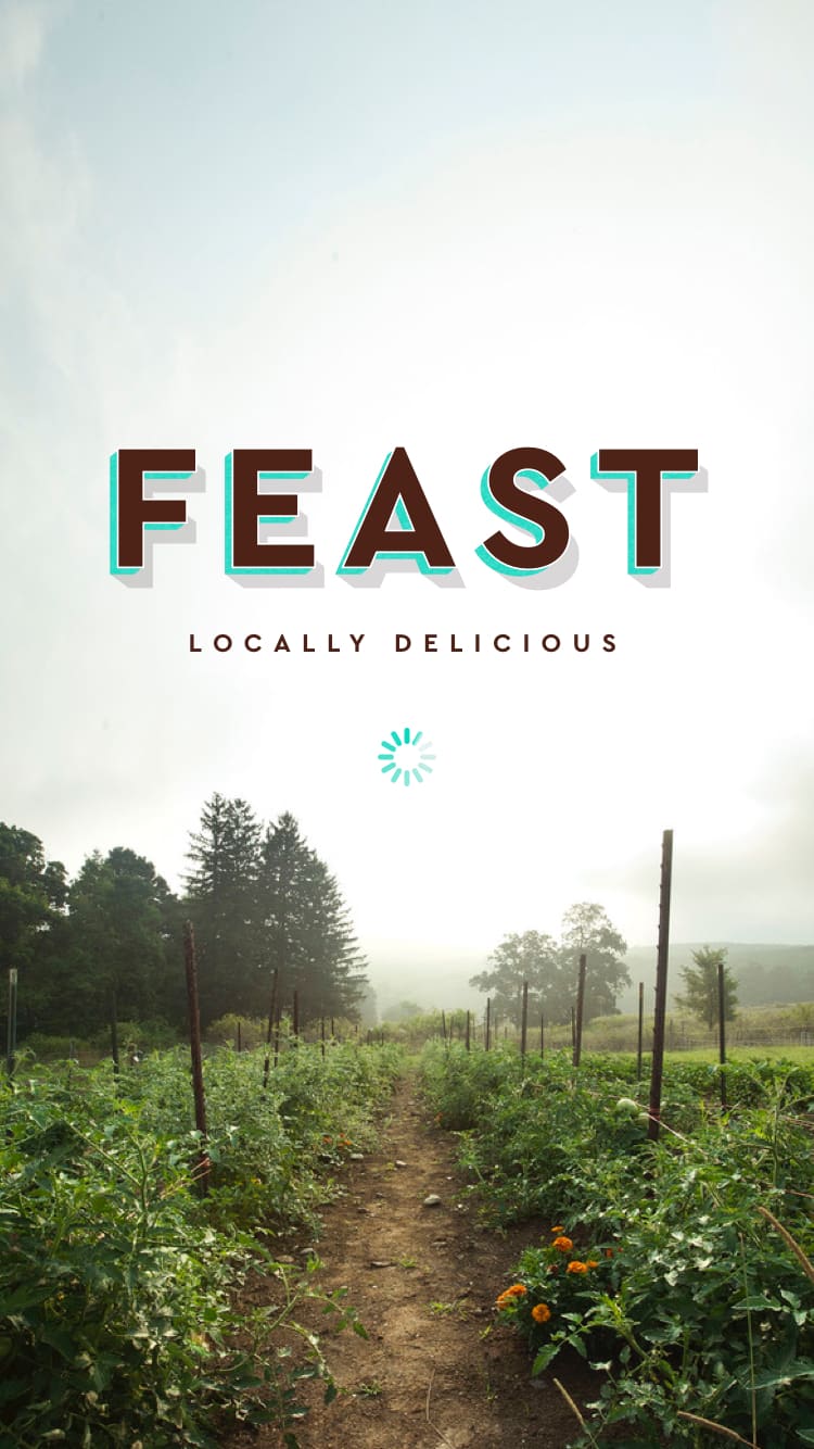
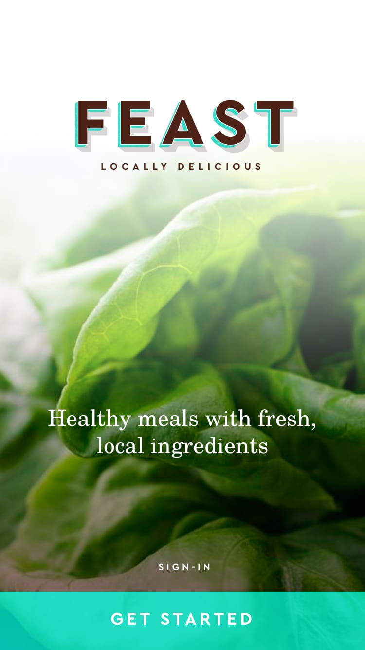
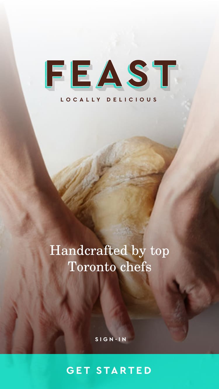
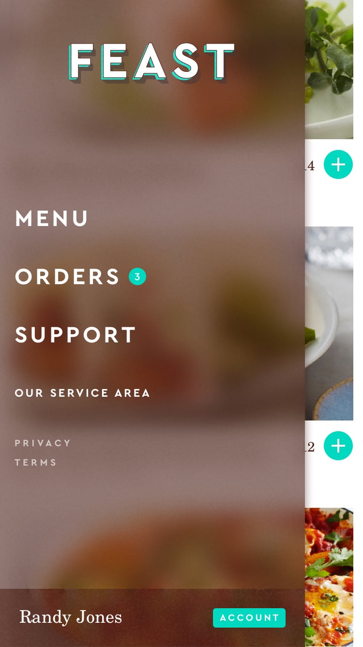
Onboarding

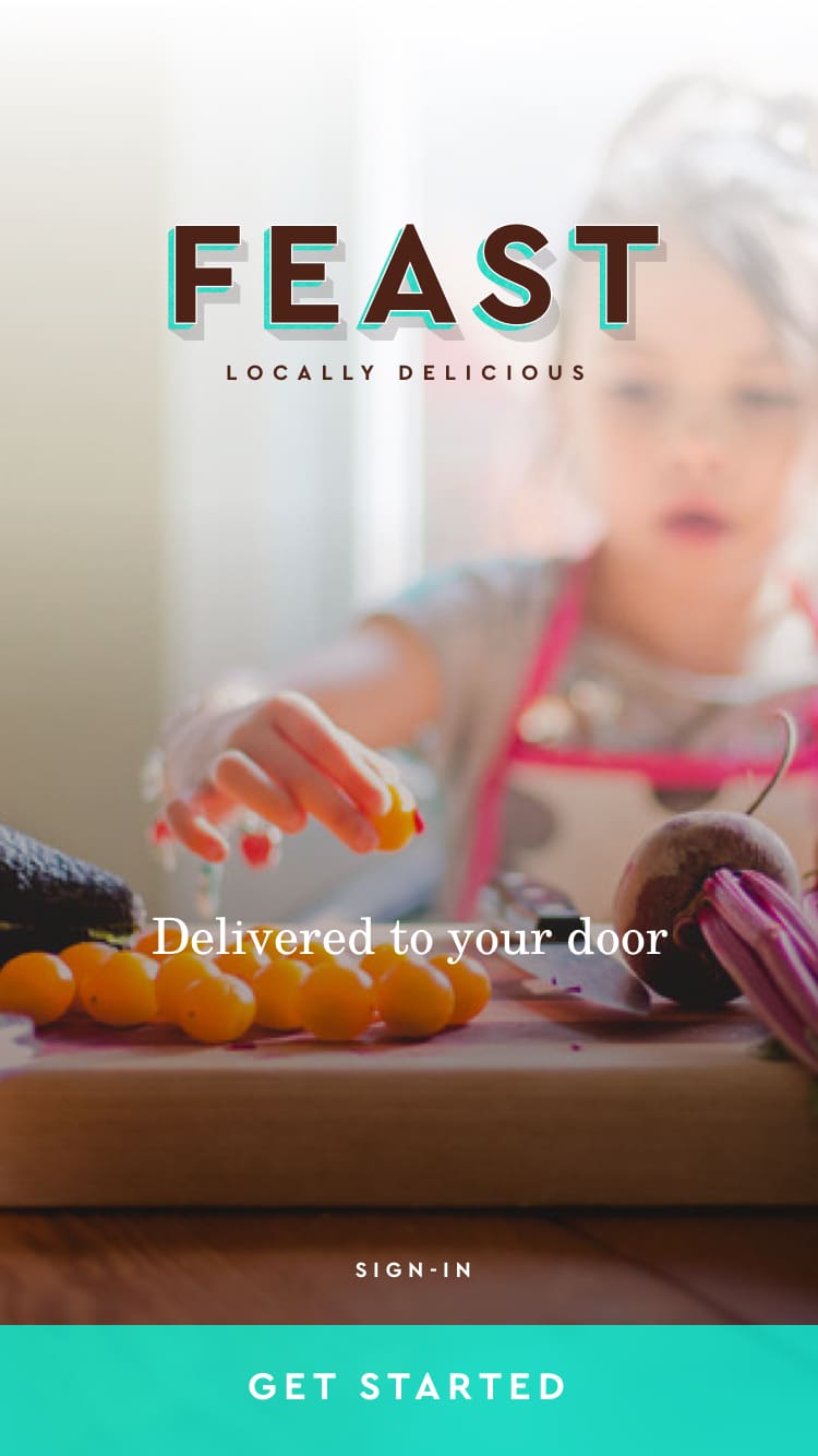
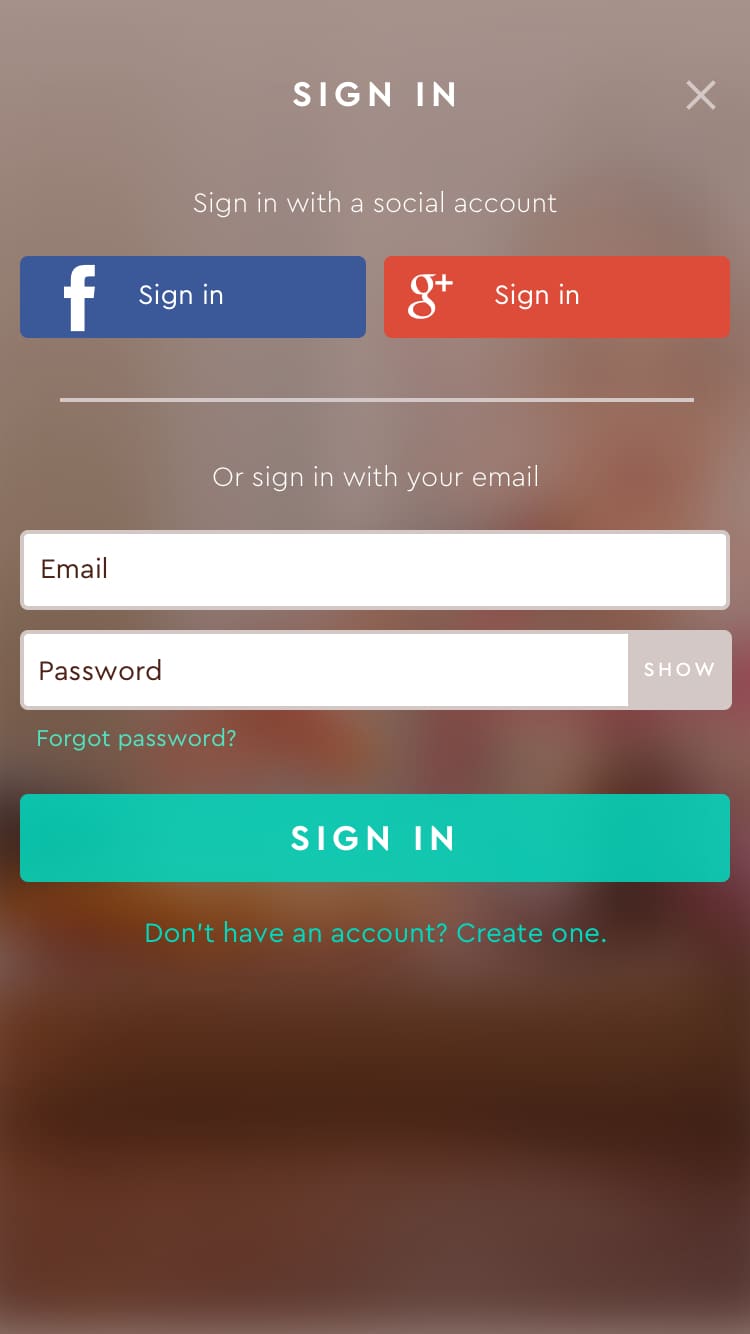
App Flows

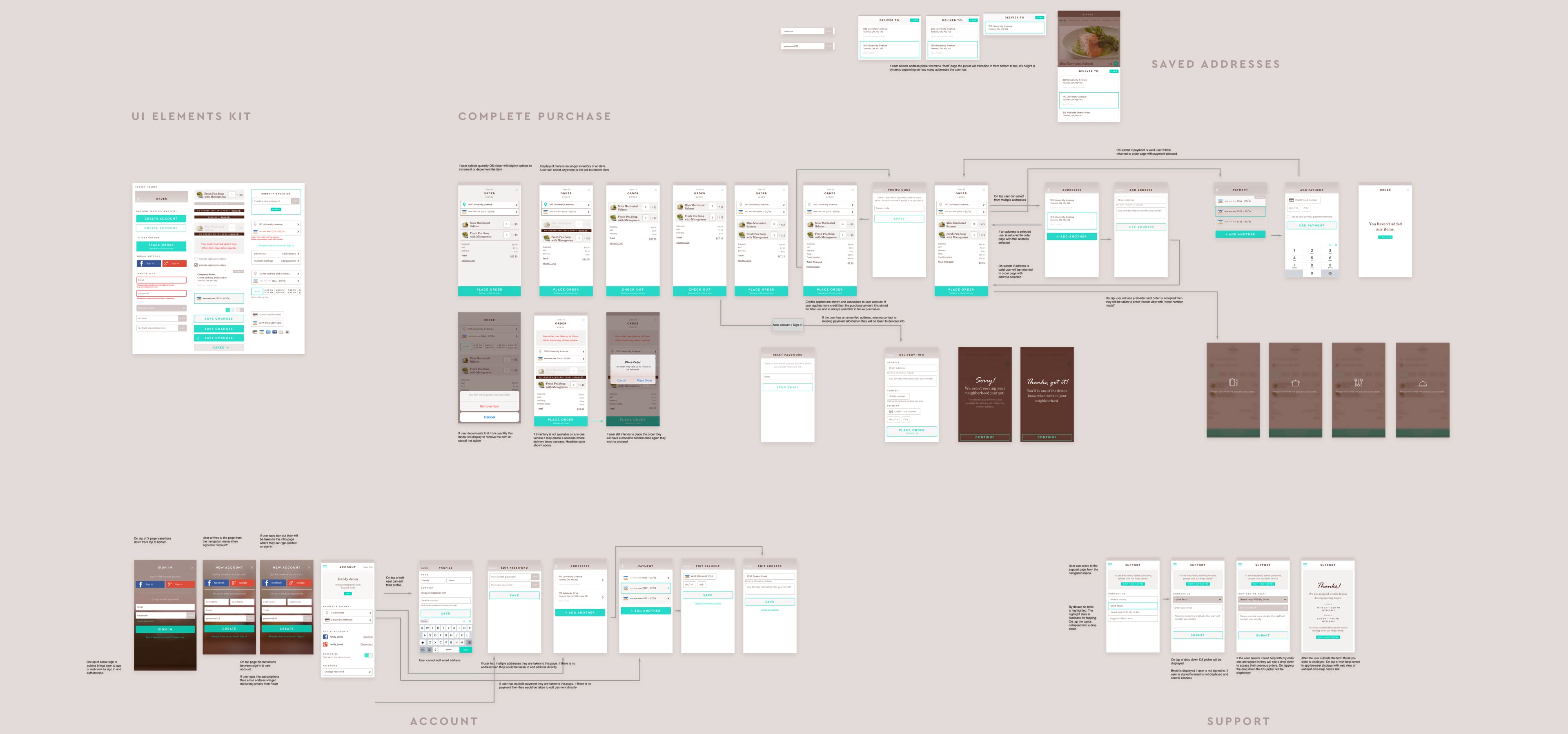
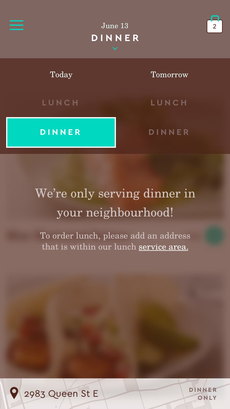
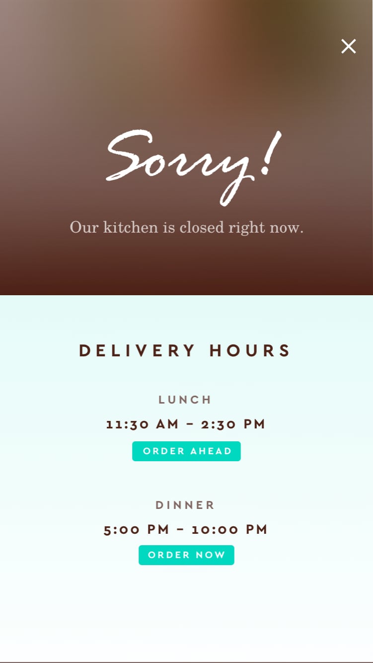
Location


Service Area / Address Validation


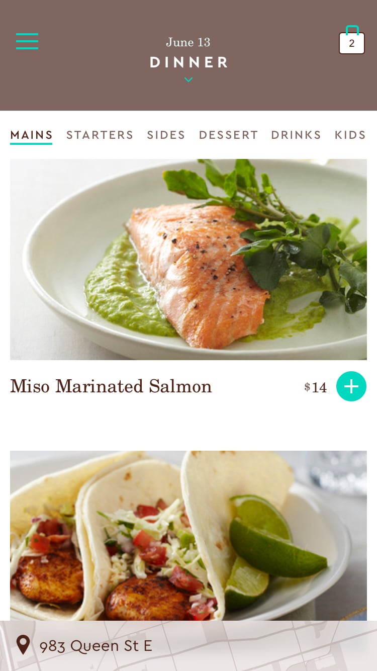
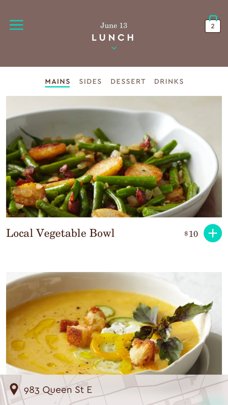
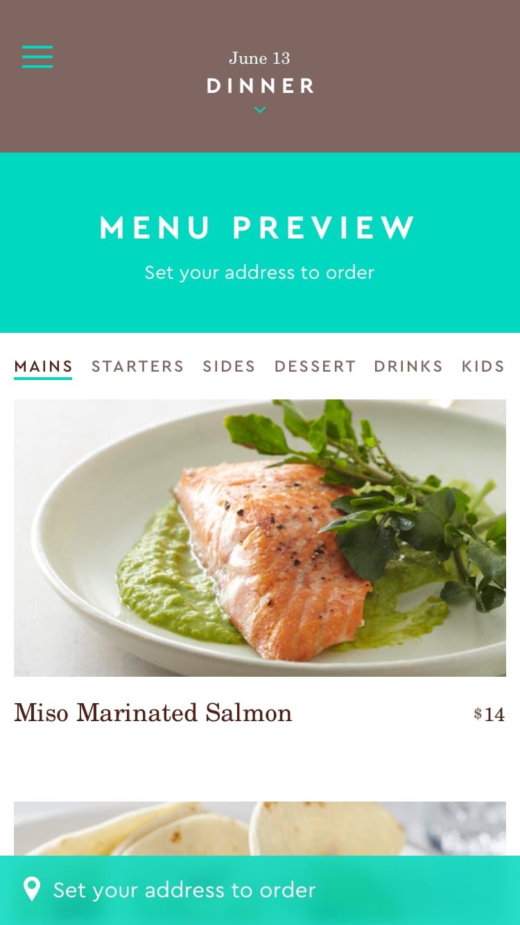
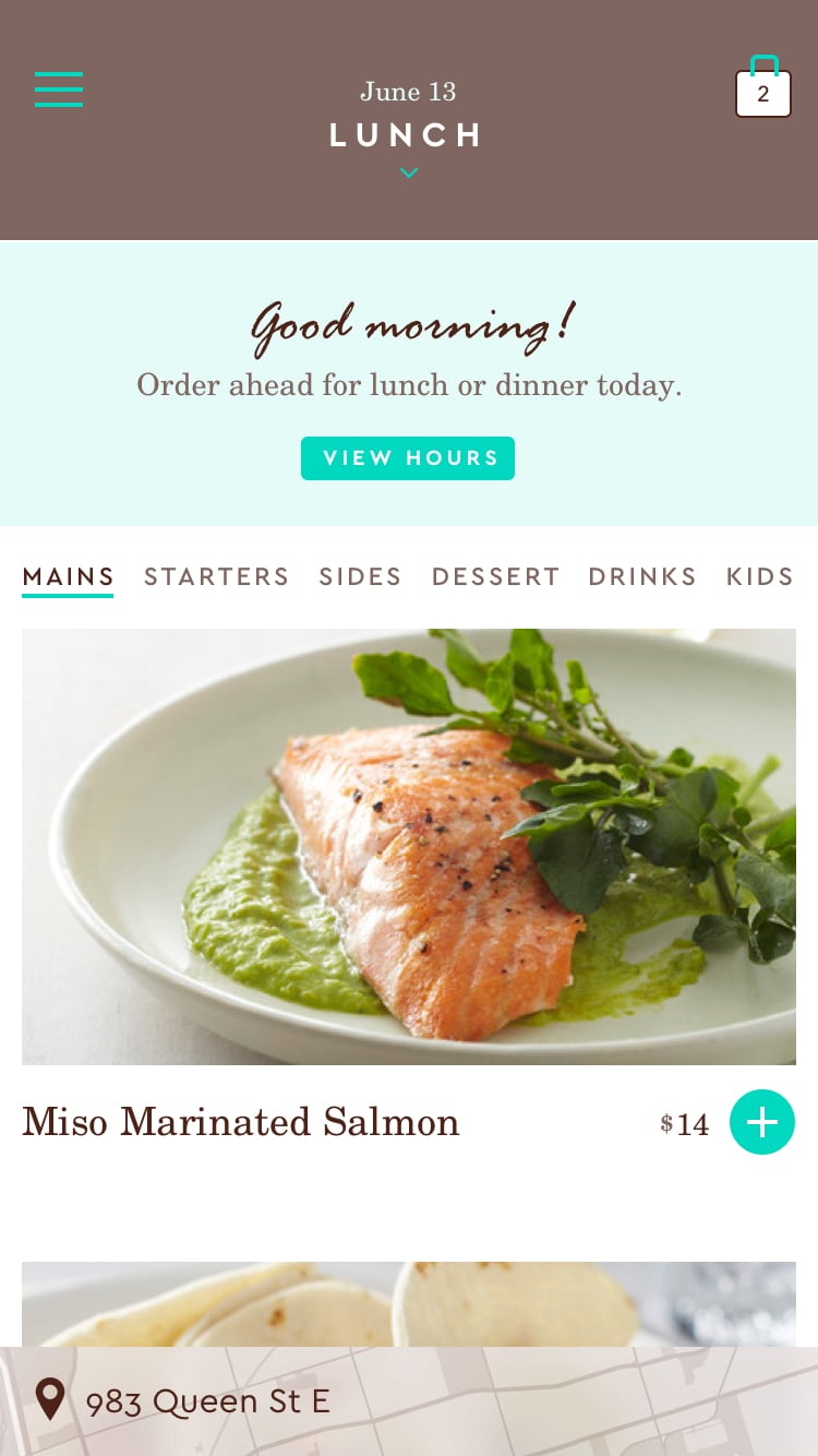
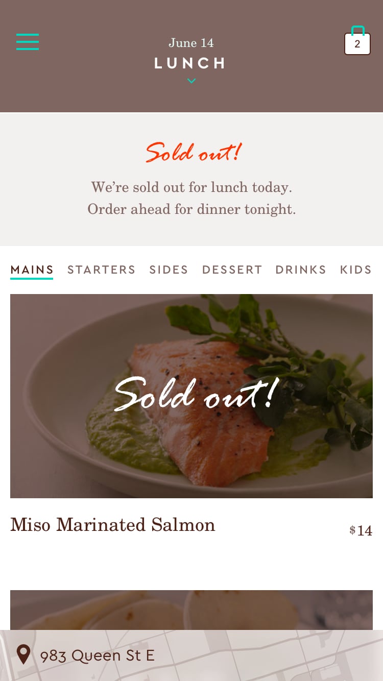

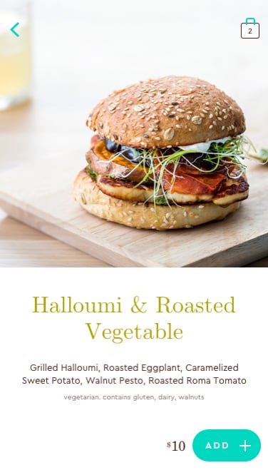

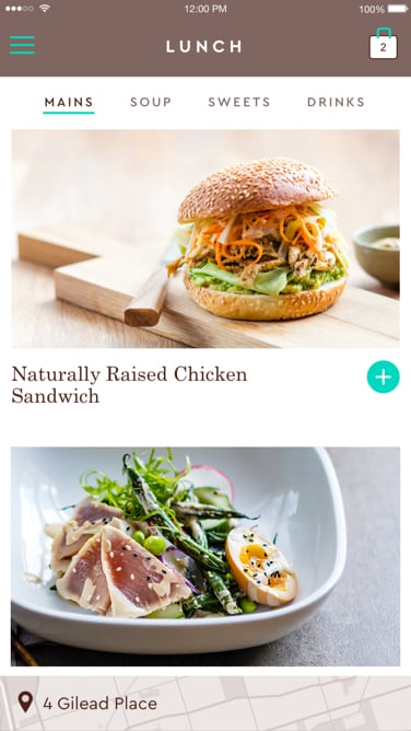
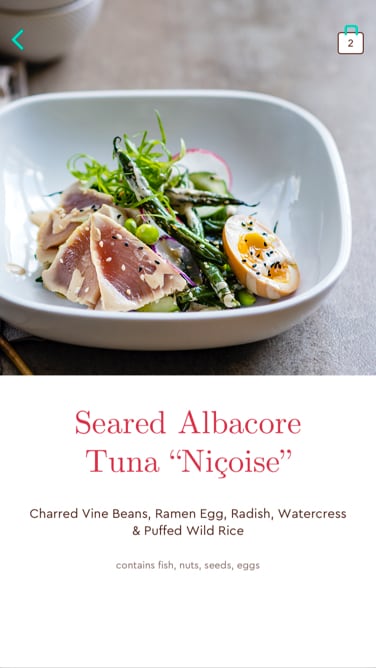
Launch Menu – Key Screens
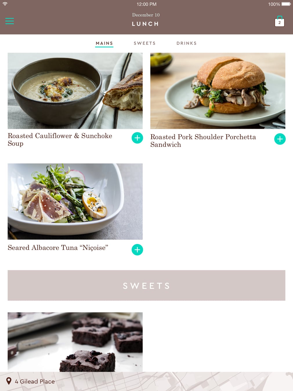
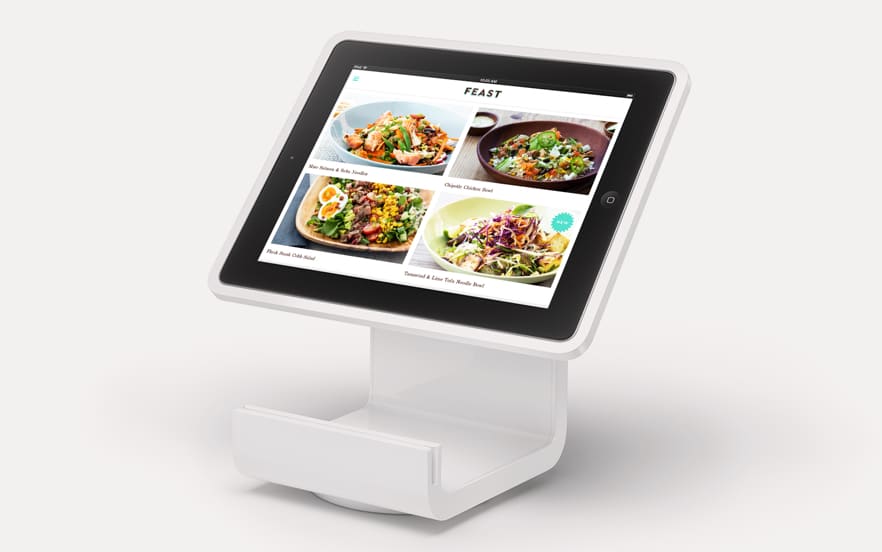
iPad
Responsive Web App


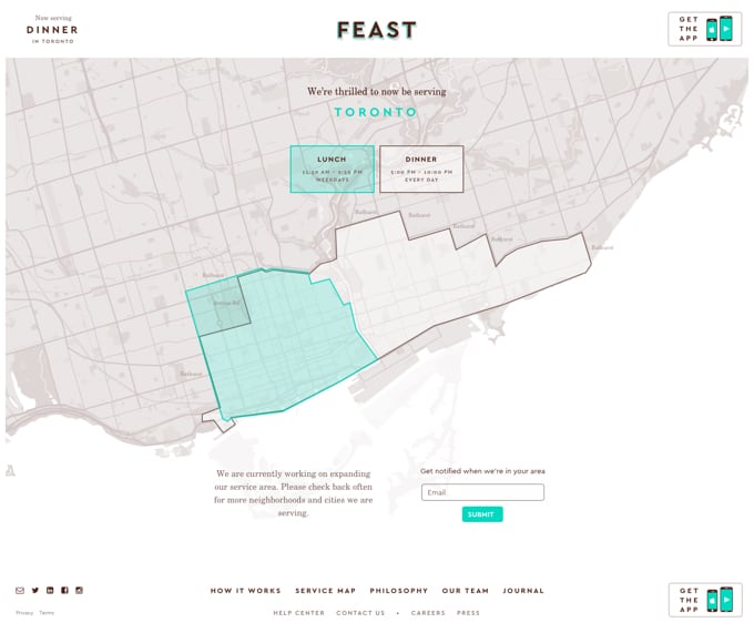
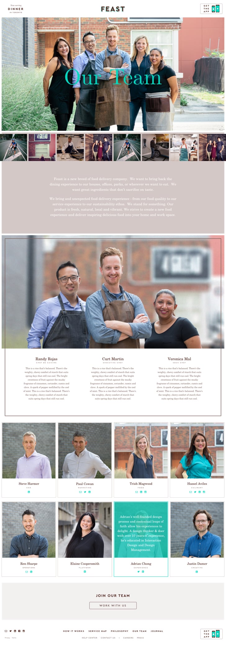
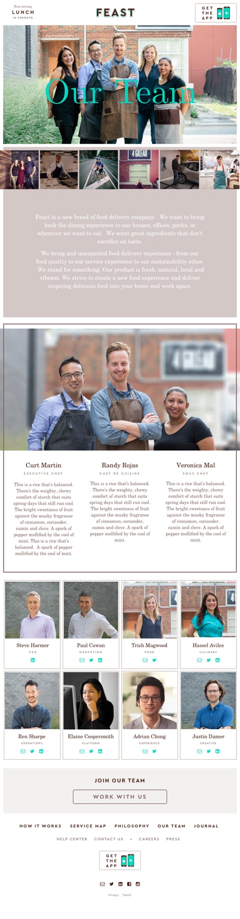
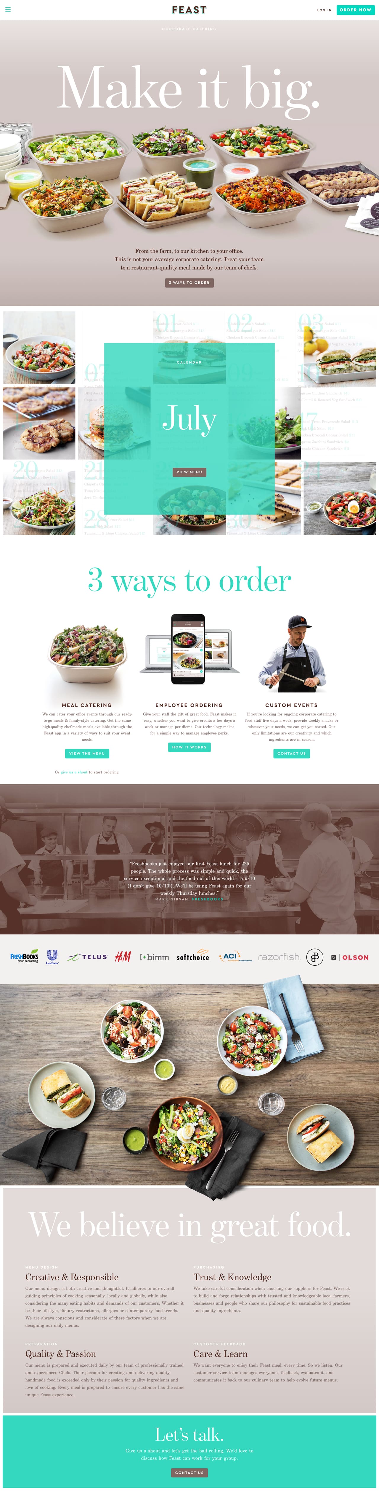
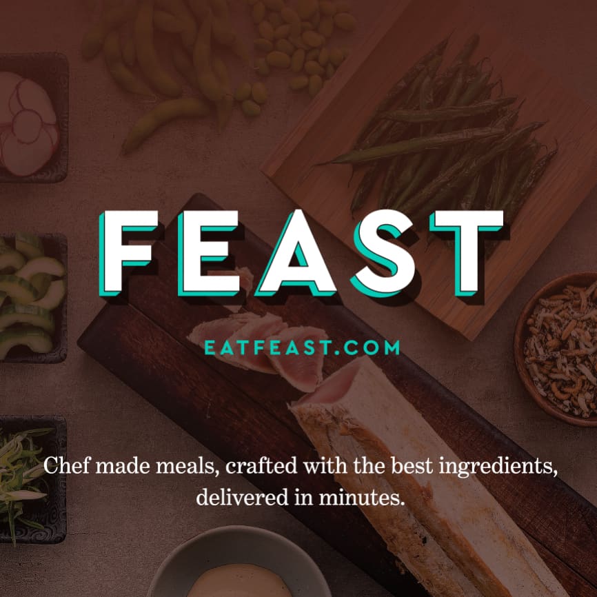
3. Marketing Website


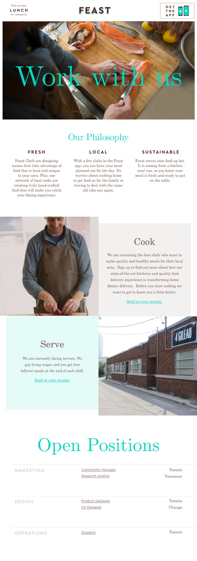
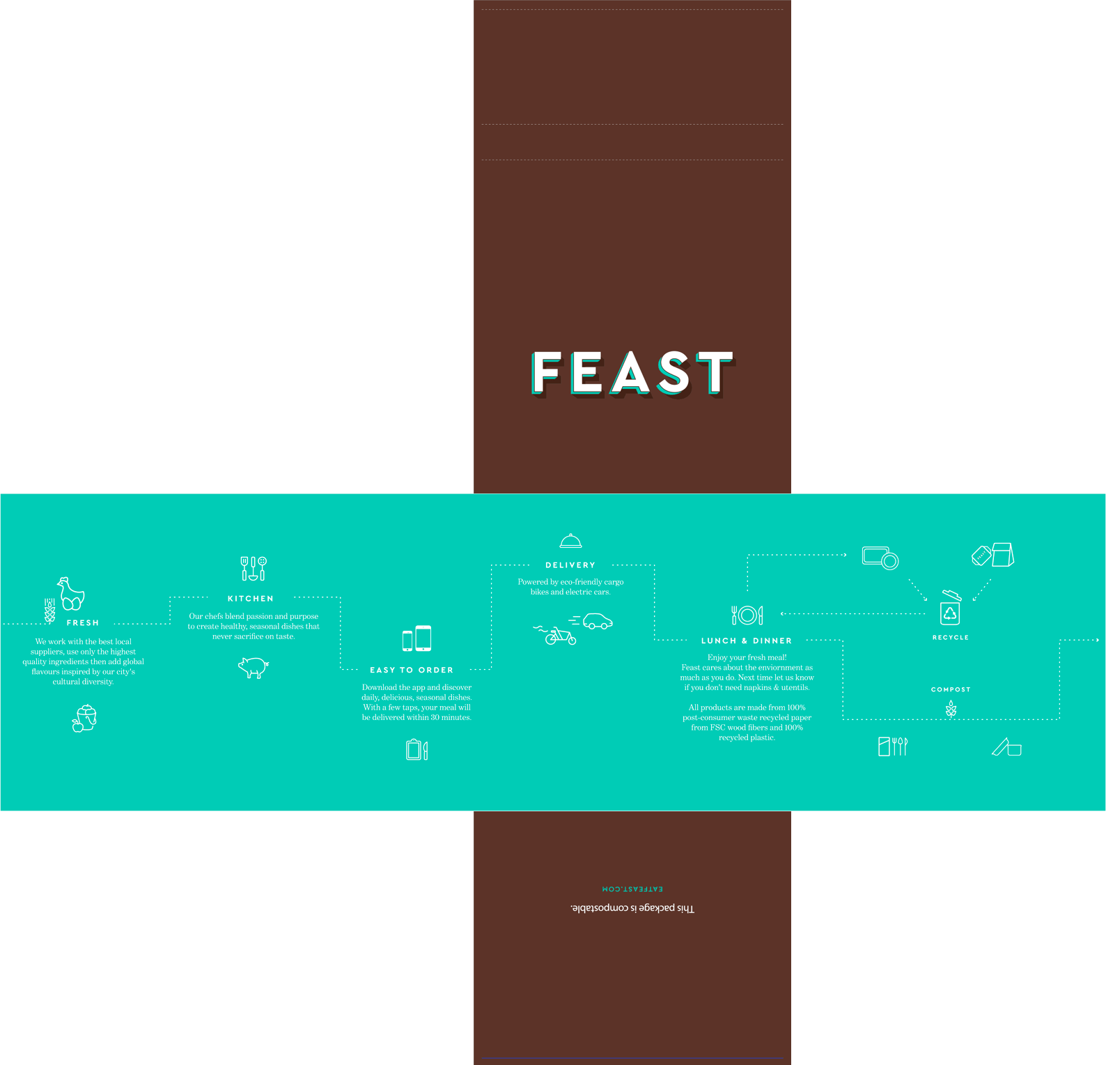
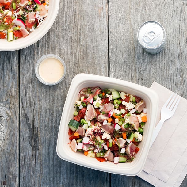
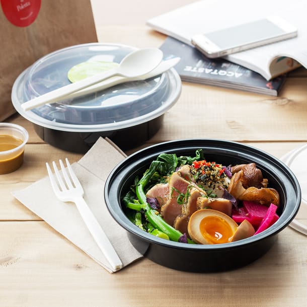
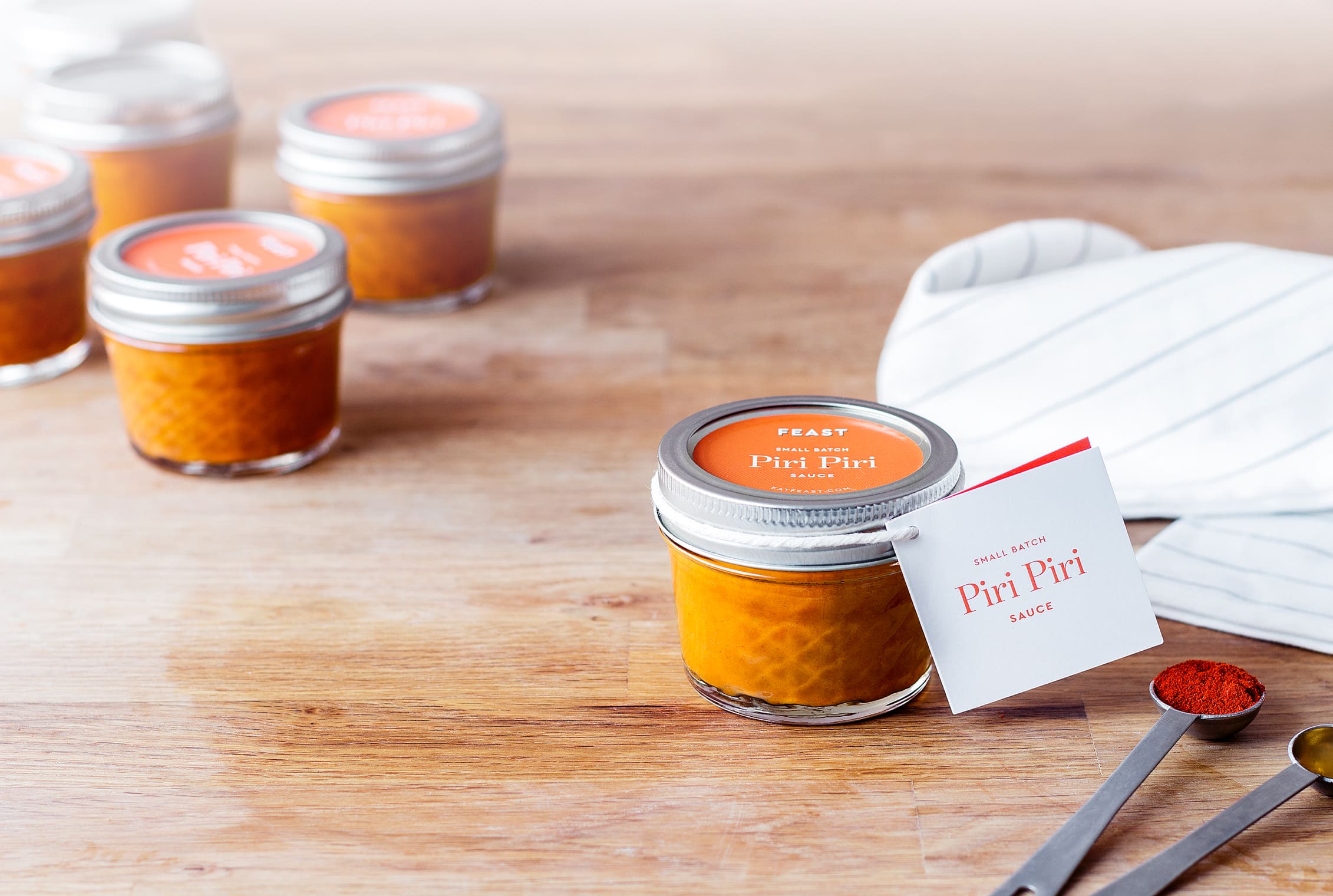
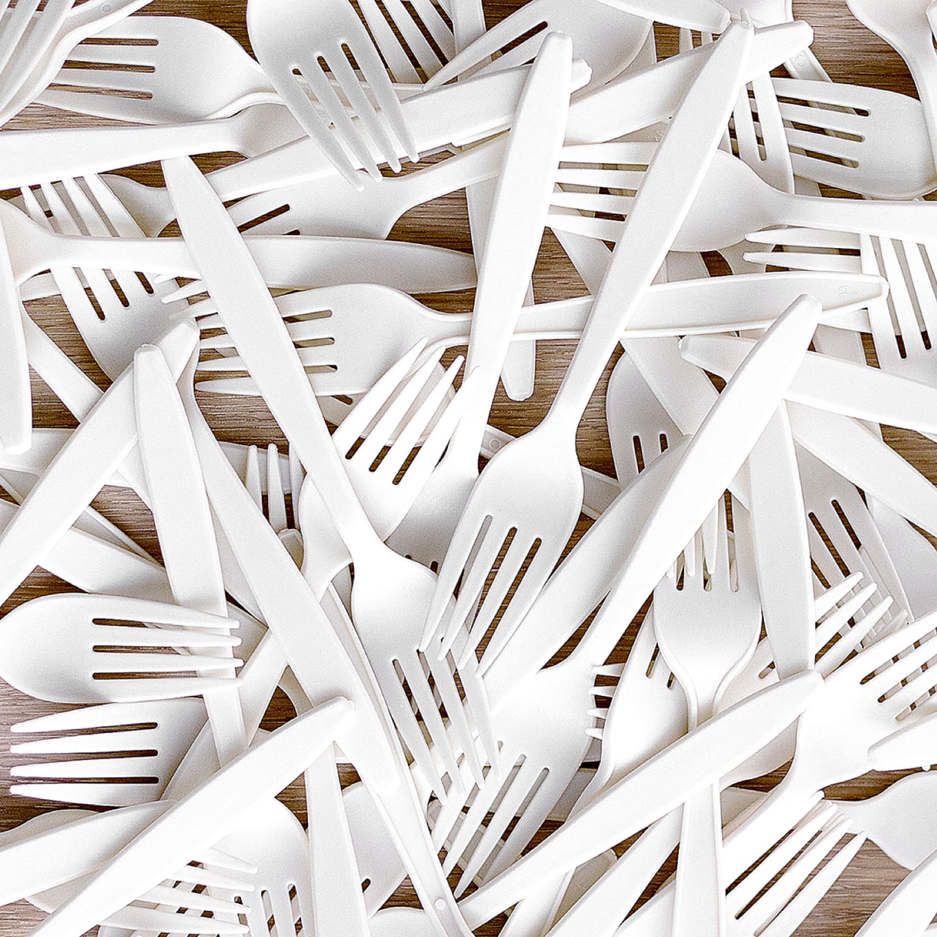
4. Packaging
Material Experiments
Early on, we designed a number of sleeve concepts, thinking we should brand the product so that when a customer walked from curbside back to their office, everyone would see what they had in hand, and ask them what it was. But the reality of food packaging is it’s expensive, wasteful, and it covers up the food.
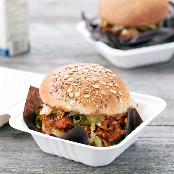
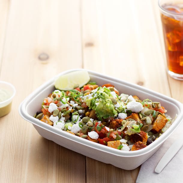
We started with opaque lids, but quickly moved to clear plastic, and from that moment on, the only reasonable solution was our simple circular sticker, coloured for each dish, matched in the app and in print, with lots of room to see the food through the package.


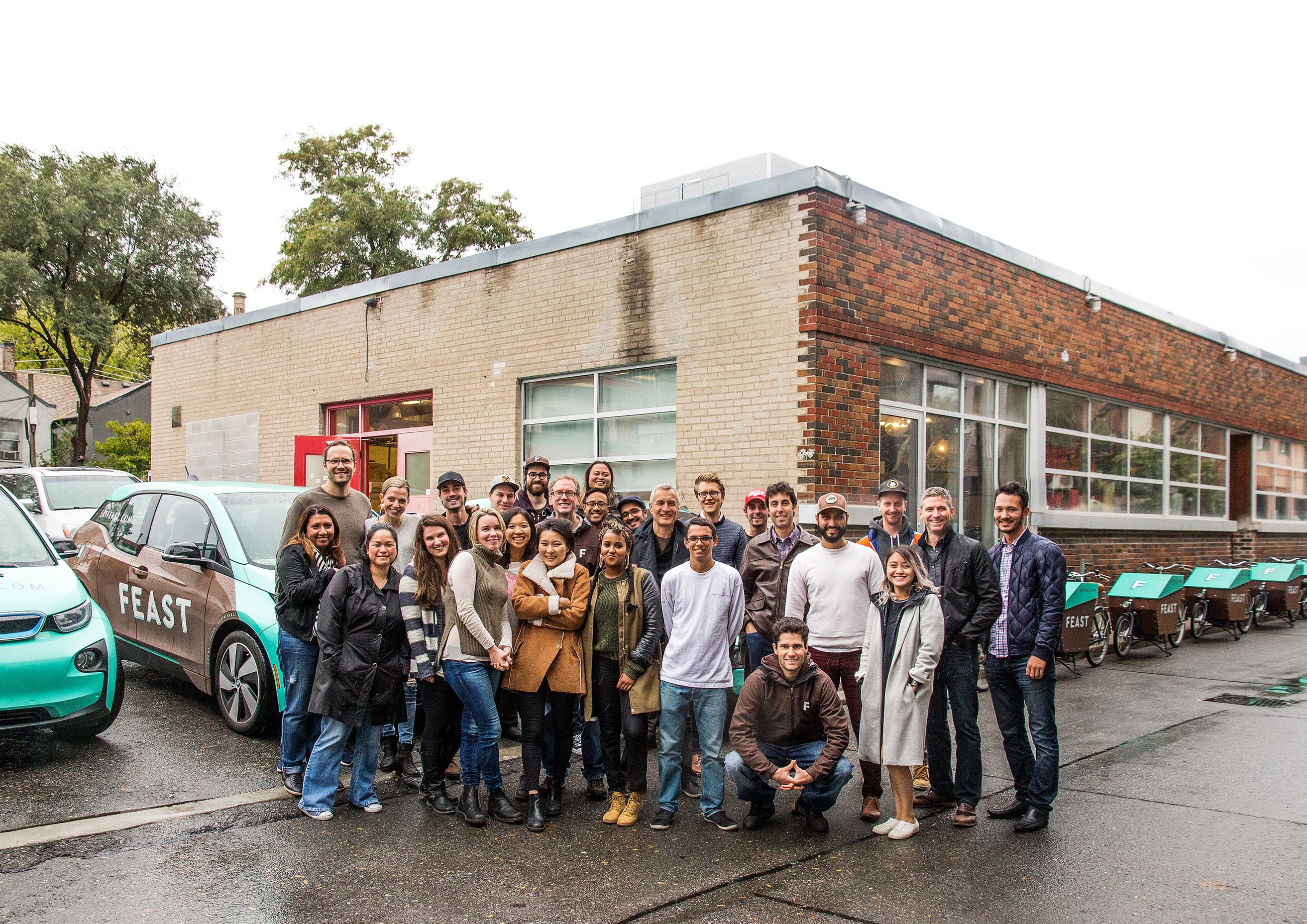
5. Vehicles
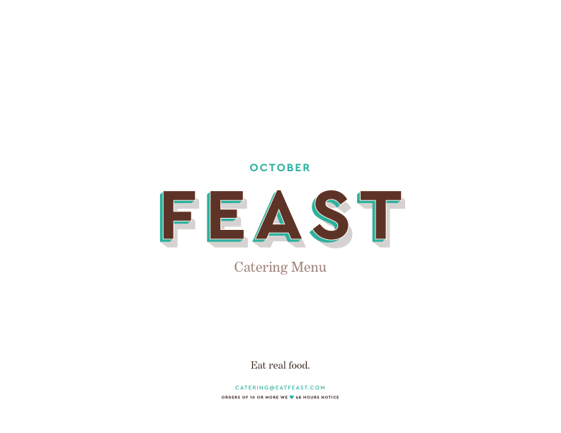
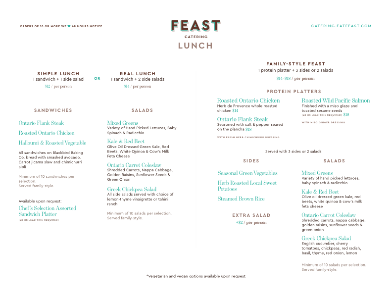
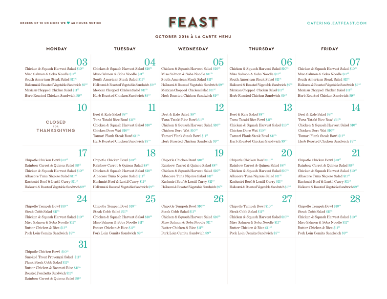
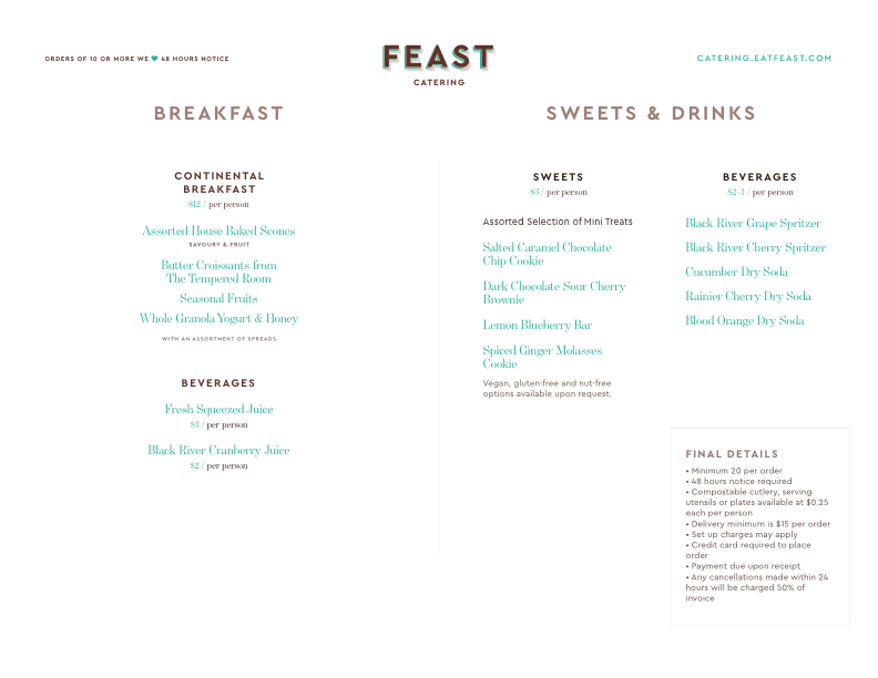
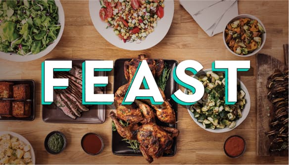
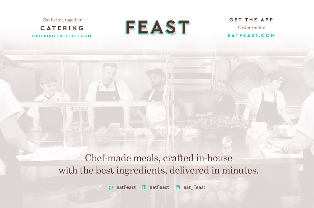
6. Catering


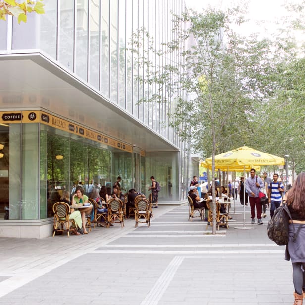
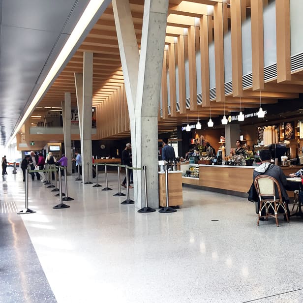
7. Retail
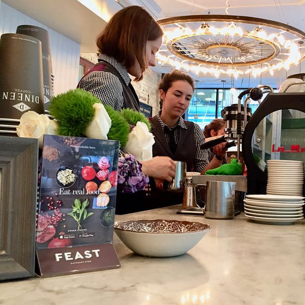
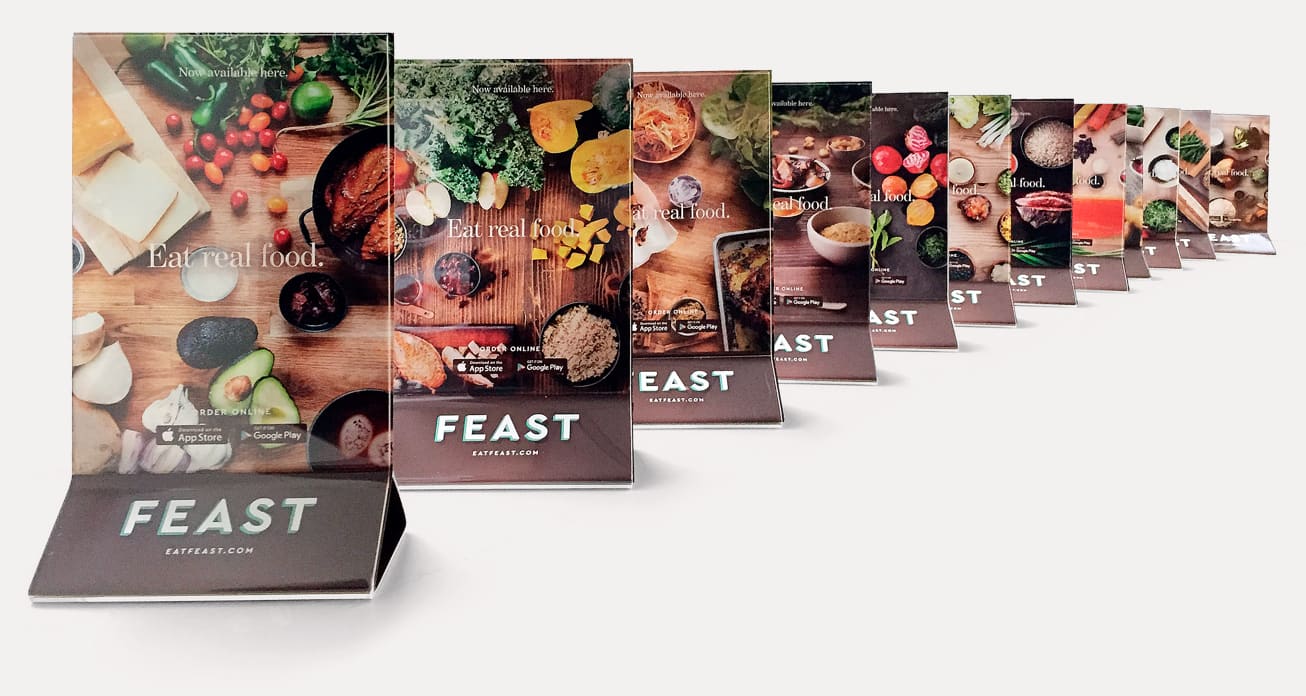


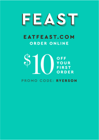
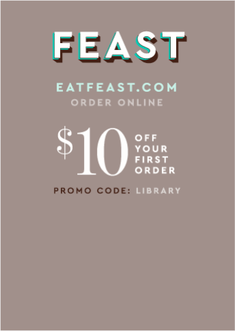
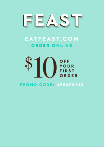
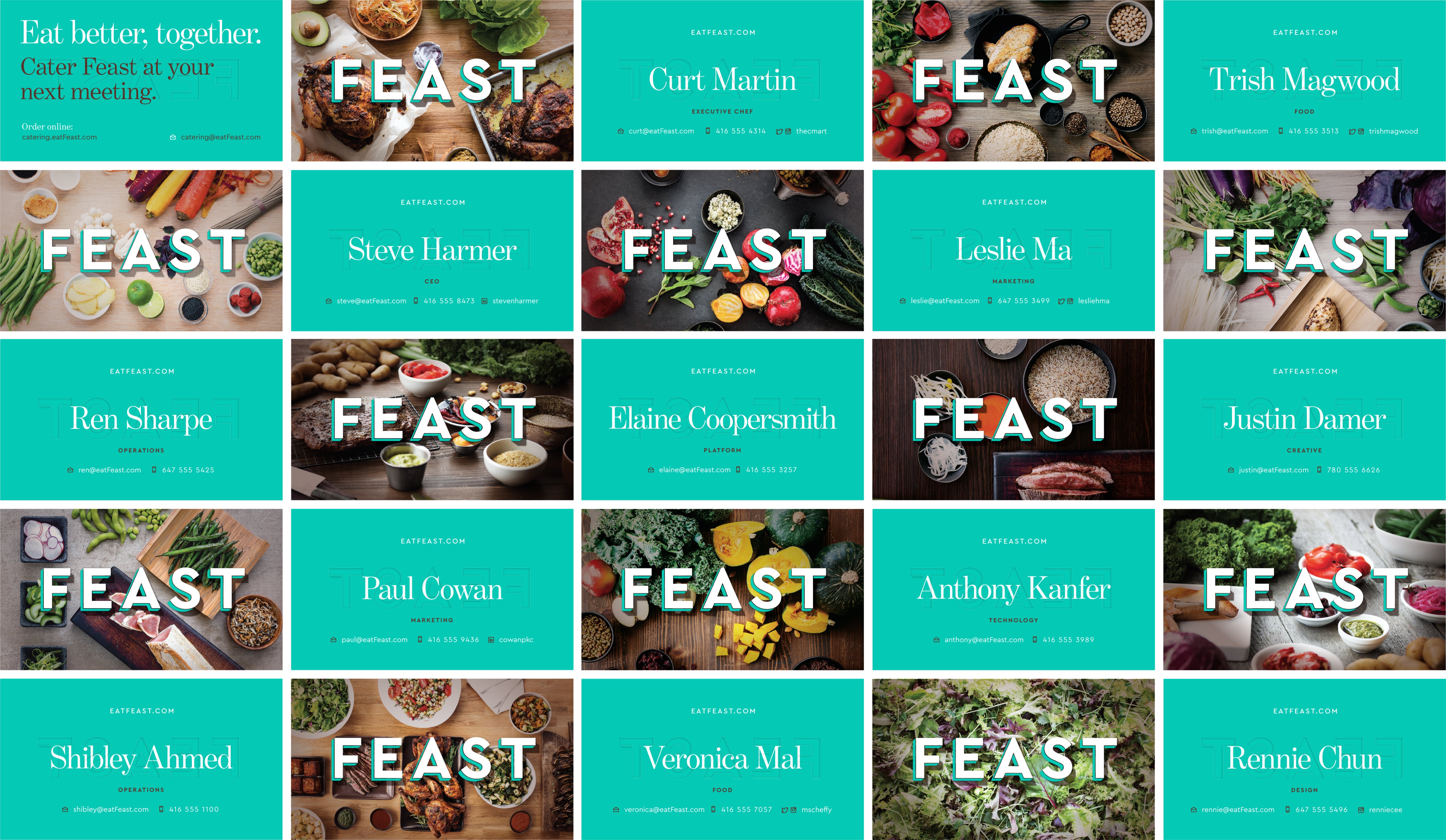
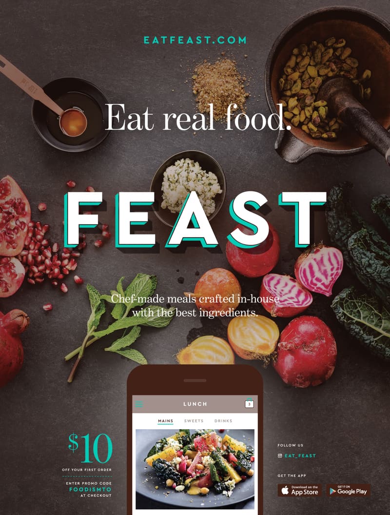
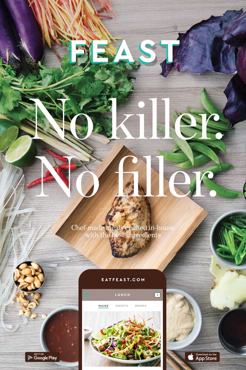
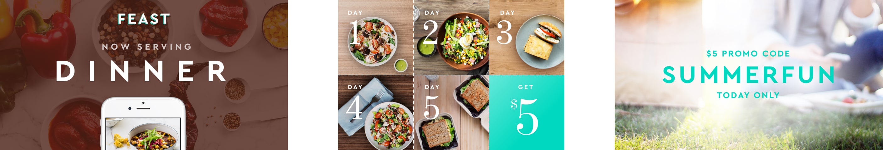
8. Print Marketing


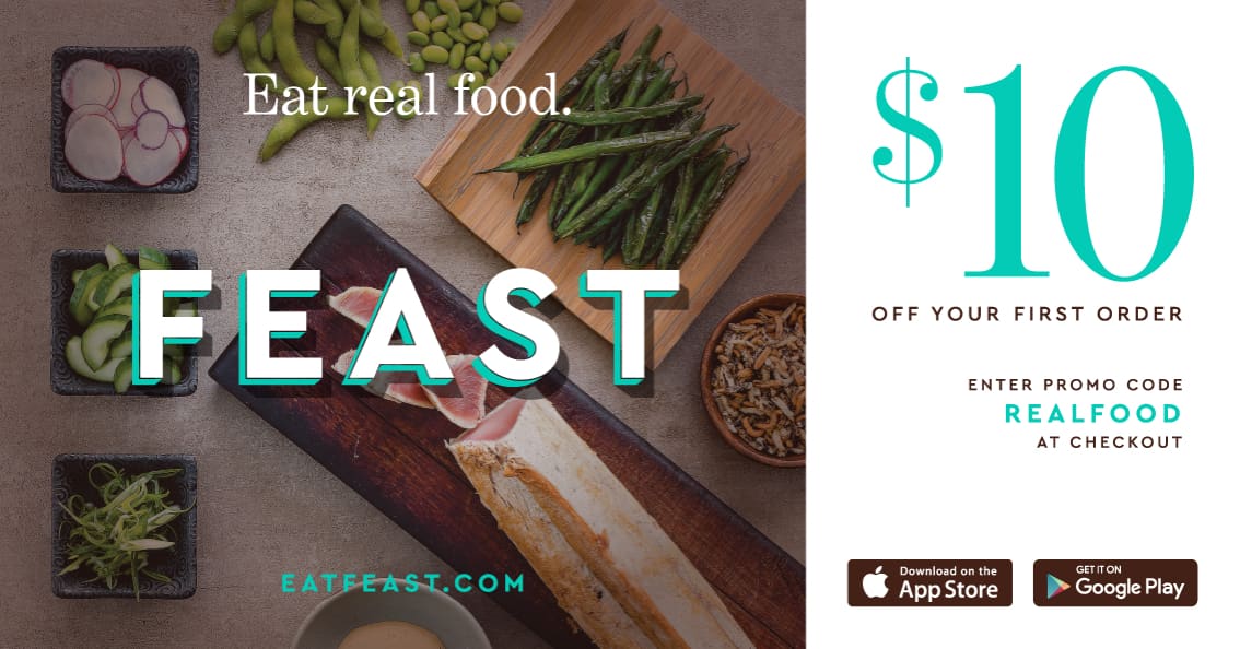
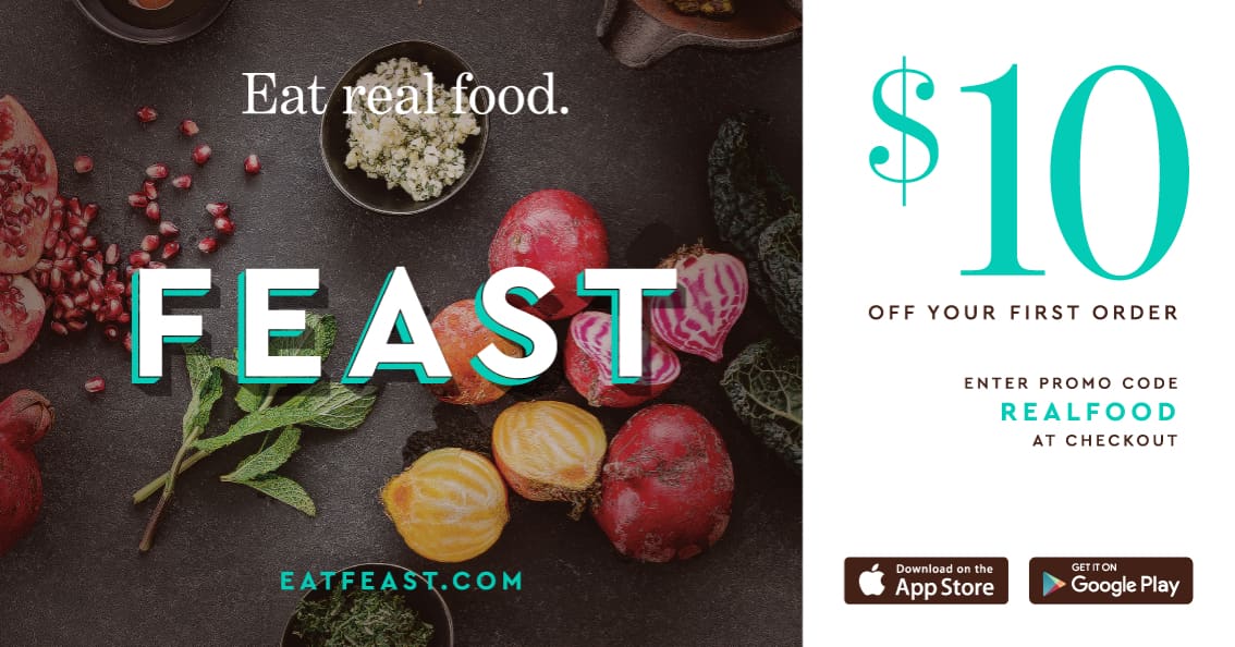


9. Social / Ads


Thanks