Uncover
Uncover
I’d never heard of Magnet Forensics. Within a few years, one off-duty cop recovering from cancer, founder Jay Saliba, making his own software for finding evidence on computers, had become a thriving company filling the former Blackberry-RIM offices in Waterloo, Ontario.
Their website didn’t align with their brand, which they’d established everywhere but online. My goal was to make a website they felt was truly theirs, based on the best materials they’d created offline. I worked closely with their in-house creative lead, Yves Lepage, to ensure that sense of ownership and to leave them with something they could build on over time.
The greatest challenge was bridging the differing visions of the in-house creative and marketing teams. My approach was to sell the ideas as their own. After a successful demo to the CEO and COO, we executed across several templates and pages, while Yves’ team built out the icon and photo set.
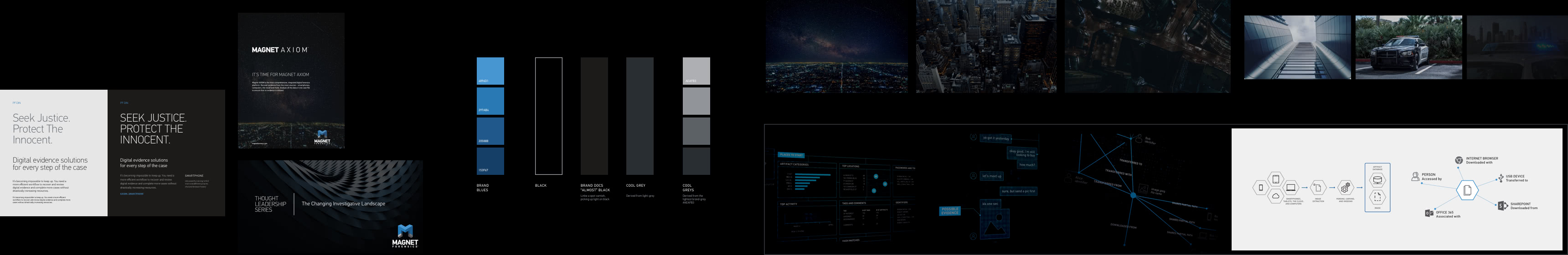
Brand Identity Audit + Curation
A thorough gathering of visual materials, editing through them and finding a common thread to apply online
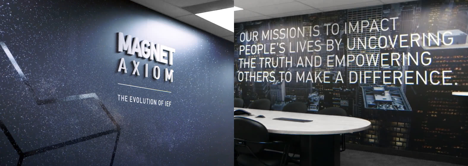
Writing on the wall: Office murals
Hidden in their conference rooms, their most heroic brand execution
Visual Palette: Dark meets light
The old website: all white and dull blue. Their print materials: all black

Global Colour Palette
Reconciling all the hues and shades used online and offline into one set with the range needed
- 4896D1
- 297AB4
- 20588B
- 153F67
- FFFFFF
- AEAFB3
- 919599
- 5C6166
- 292E33
- 1C1B1A
- 000000
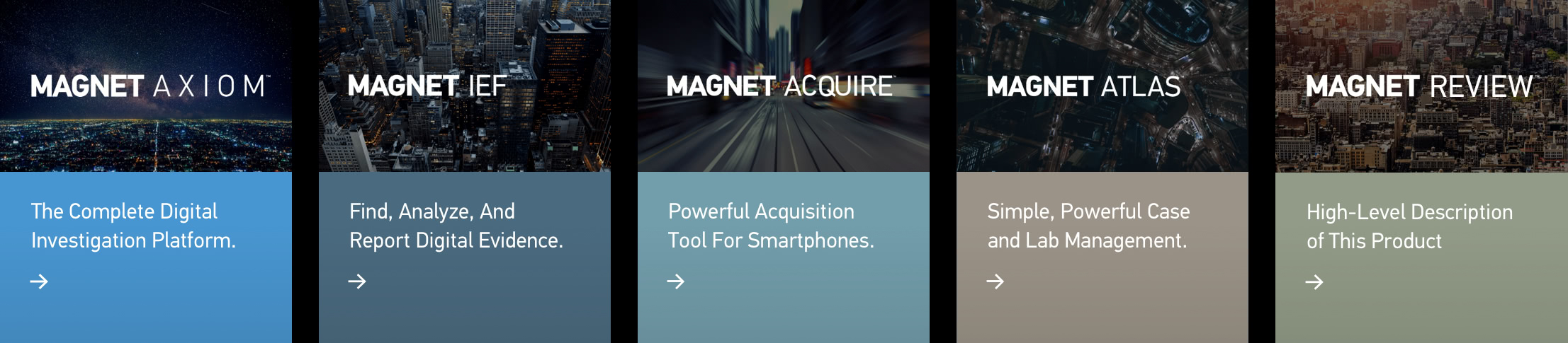
Product Colour Palette
Adding tones to differentiate the product lines, distinct but of a family

Typography
The simplest, greatest way to ensure a consistent voice online and offline
PF Din
Thin All-Caps
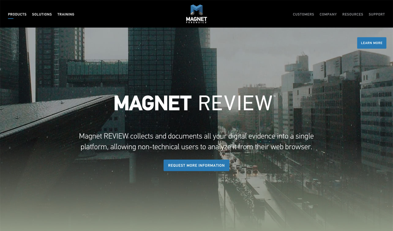
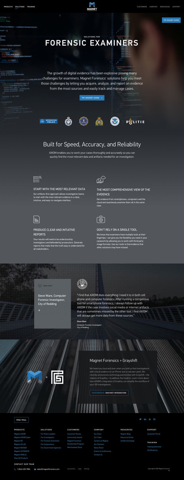
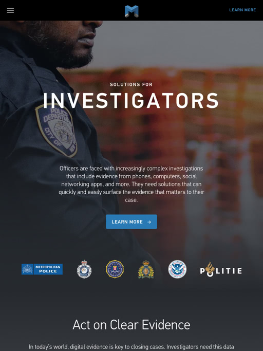
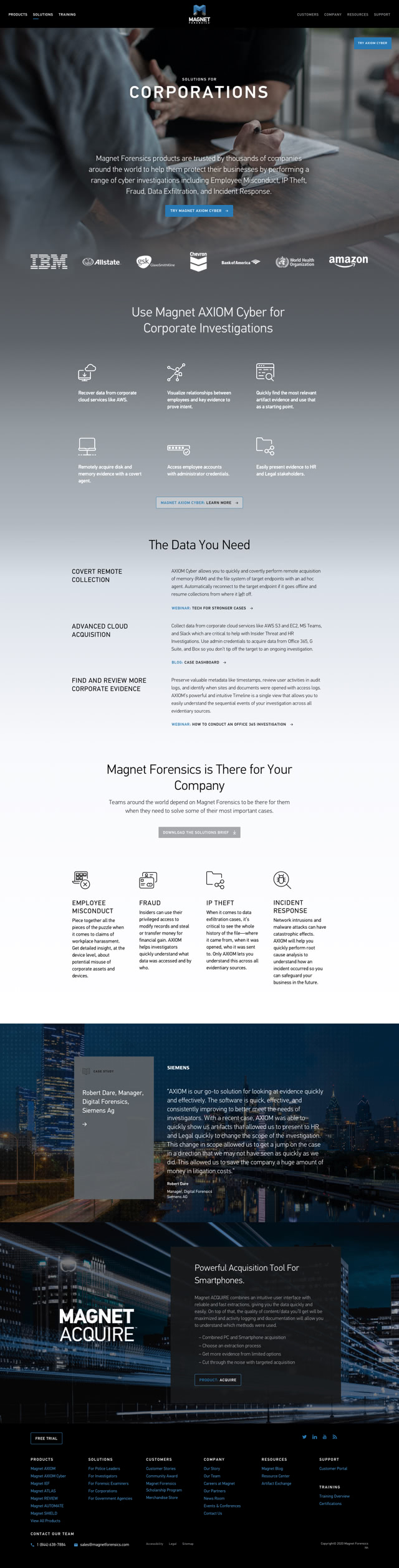
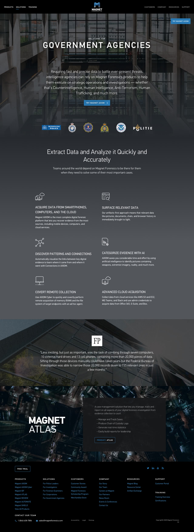
Our mission is to impact people’s lives by uncovering the truth and empowering others to make a difference.
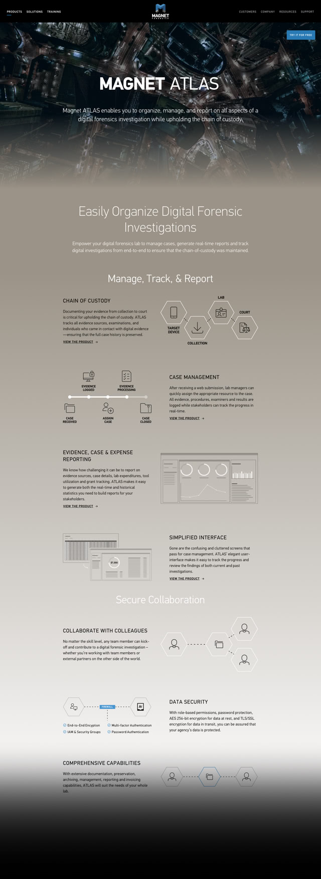
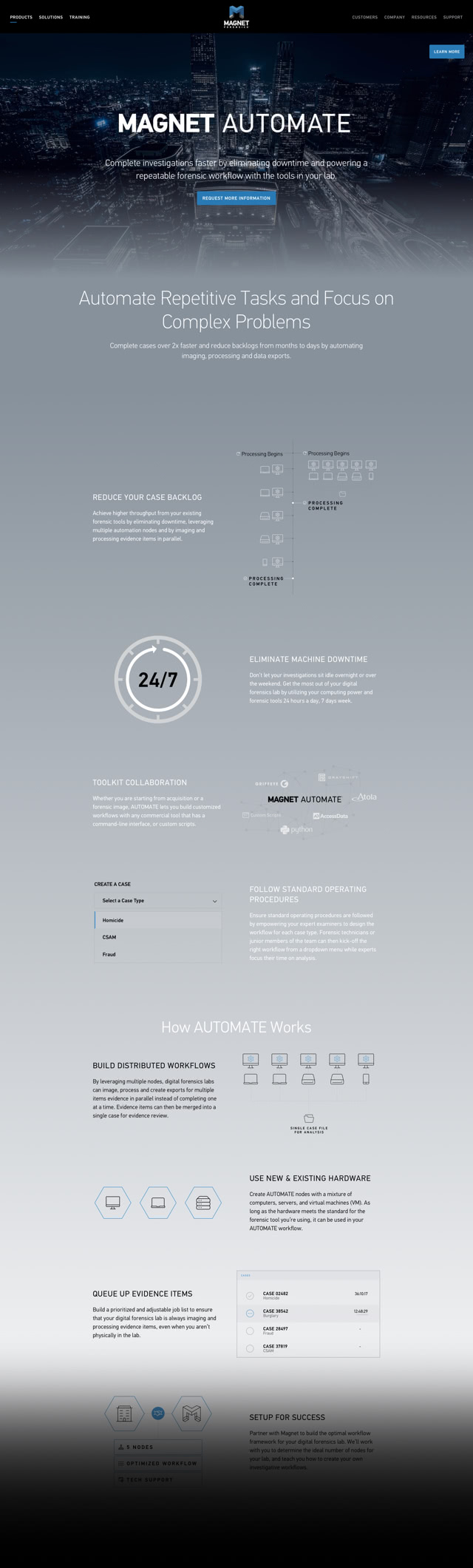
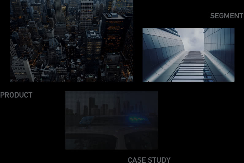
Layered UI Design
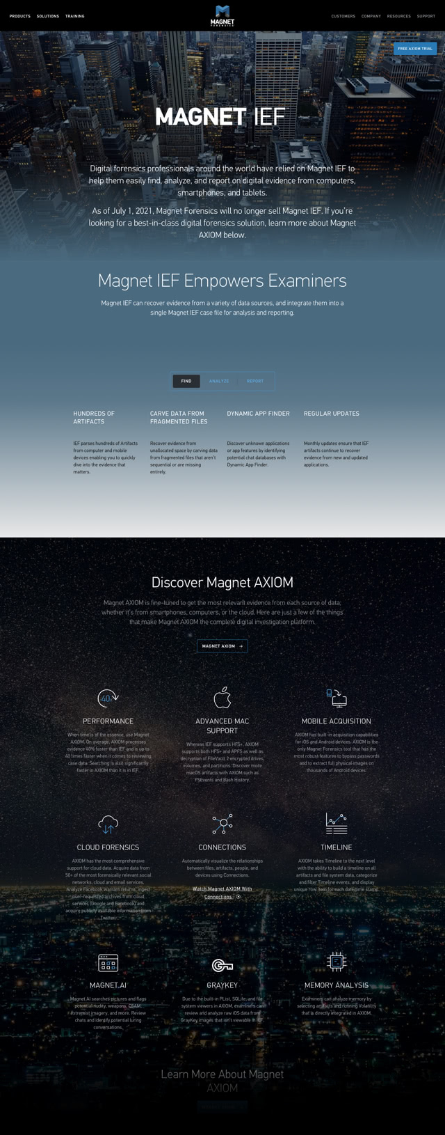
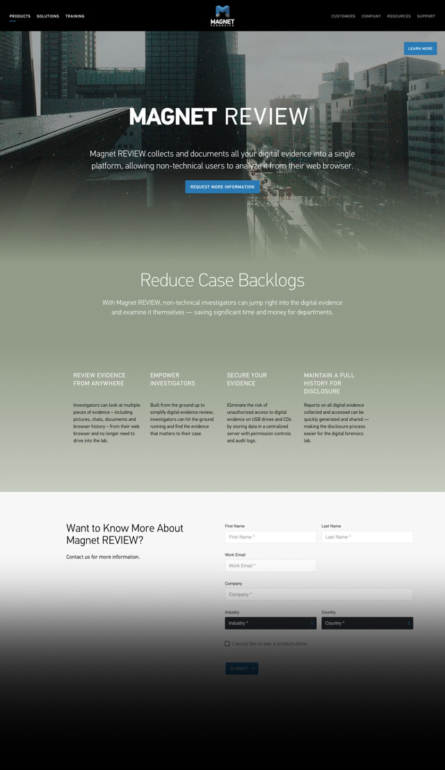
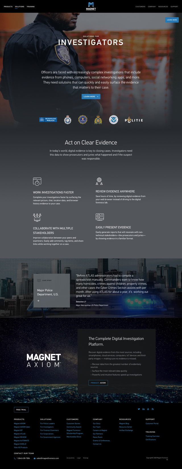
The Big Picture
A constant reminder of the larger mission that drives what we do, connecting our technology to real-world user needs throughout the experience.
The visual richness of murals inspire, even when the content is text-focused and feature-dense. Never a dull moment.
Modular, Stacked Content Modules
Multi-faceted content of varying complexity is contained in a layer above the big picture, where it can be focused on clear communication.
Simple layout allows use across the site as “content components”, creating a consistent pattern within a flexible framework.
Visual breaks between content modules reveal the big picture underneath, connecting back to the larger purpose.

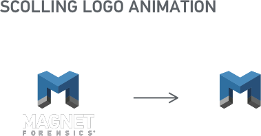
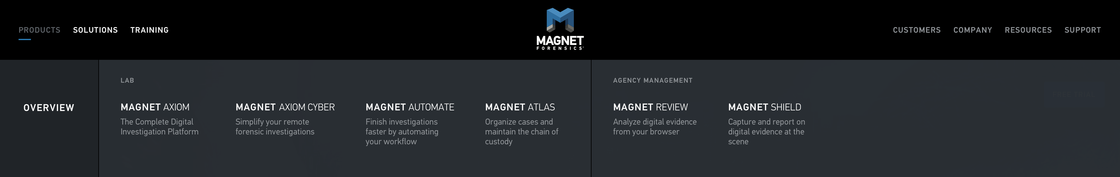
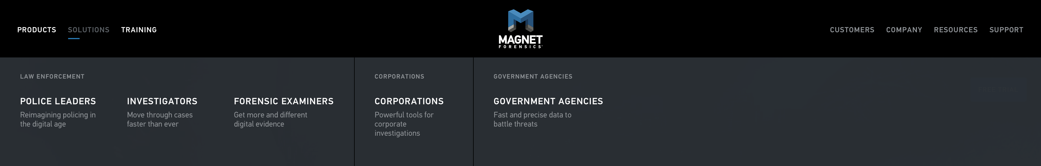
Brand-centric Navigation
The Magnet “magnet” charged at the centre, section links aligned to each pole:
New customers on the left, existing users on the right.